
Member since
TY Card Help

Member since
Re: TY Card Help
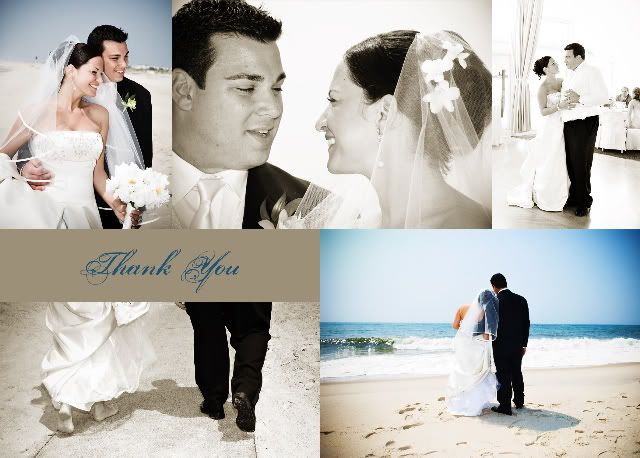
I like the 1st one alot !!! It has an extra picture and the symmetry is better for me....looks cleaner to me......there's something about the extra beige blocks on the edges of the second one that I don't like.
Member since
Re: TY Card Help
dang you made it hard they are both gorgeous..I say #2 I like the names & layout..
Member since
Re: TY Card Help
I like #2 the best ... i think it flows better - esp with your names
Member since
Re: TY Card Help
Member since
Re: TY Card Help
I like the second one better too I think
Member since
Re: TY Card Help
whoah--- that is a relaly hard decision- they are both breath taking!!!!
Member since
Re: TY Card Help
so after looking at them again...i changed my mind lol....i realized i really like #1 better b/c theres an extra picture and i love how the bottom two pics look side by side!
Member since
Re: TY Card Help
Member since
Re: TY Card Help
Member since
Re: TY Card Help
I love love love both, but my vote is for #1
Member since
Re: TY Card Help
I like the second one better.
Member since
Re: TY Card Help
I like the 2nd one I like the names and layout better
Member since
Re: TY Card Help
I like number one! These thank yous are beautiful!
Member since
Re: TY Card Help
I really like #1! I like how the black and white pictures aren't only on one side and I like the extra picture. But both look great!
Member since
Re: TY Card Help
Member since
Re: TY Card Help
#2
Member since
Re: TY Card Help
I like #2 better, but they are both gorgeous! I really love your pics!
Member since

