Post New Topic

Channa Plaque Vote

MongieToBe Posted:

Channa Plaque Vote

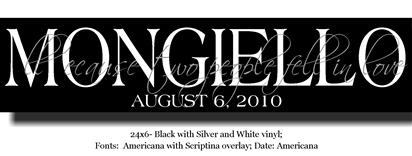
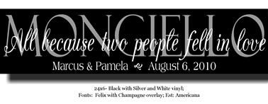
So Channa has sent me soo many proofs, God bless her! She knows in the 2nd one that the A in 'All' and the b in 'because' is missing b/c of software glitch.

Opinions please!

(The gray you see is actually a shimmery silver, not a dull gray...can't tell from computer mockup)
SummerBride10 Posted:

Re: Channa Plaque Vote

I like the second one much better!

nicopico13 Posted:

Re: Channa Plaque Vote

Me too, my vote was for #2

MongieToBe Posted:

Re: Channa Plaque Vote


Posted by SummerBride10

I like the second one much better!


What do you like better about it? Do you like the color combo (silver last name with the white overlay) and the actual design? Just the design?
mariedsgn Posted:

Re: Channa Plaque Vote

# 2

SummerBride10 Posted:

Re: Channa Plaque Vote


Posted by MongieToBe


Posted by SummerBride10

I like the second one much better!


What do you like better about it? Do you like the color combo (silver last name with the white overlay) and the actual design? Just the design?


Pretty much everything. But mostly because the quote is hard to read in the first one. I had mine done in silver..our names (the overlay) and its somewhat difficult to read. So make sure you're careful with the silver!!
Clover23 Posted:

Re: Channa Plaque Vote

i like the first one better but with #2 color setup

AngnShaun Posted:

Re: Channa Plaque Vote


Posted by MongieToBe


Posted by SummerBride10

I like the second one much better!


What do you like better about it? Do you like the color combo (silver last name with the white overlay) and the actual design? Just the design?


Everything... the fonts look good together.. i like the name and date on the bottom... great saying
M_Berk-Glenn Posted:

Re: Channa Plaque Vote

I like 2 bcuz of the silver w/white overlay & font choice...you can read it better

JessNicole7EM Posted:

Re: Channa Plaque Vote

I like the fonts on the 2nd one better. but I like the first one better overall with just the last name especially if you plan to hang it in your home.

I vote for 1
MongieToBe Posted:

Re: Channa Plaque Vote


Posted by JessNicole7EM

I like the fonts on the 2nd one better. but I like the first one better overall with just the last name especially if you plan to hang it in your home.

I vote for 1


Yea, I was debating if I want just the date or our names and the date...still not sure what I want! But I do like the fonts better on #2 also.
MongieToBe Posted:

Re: Channa Plaque Vote


Posted by SummerBride10
What do you like better about it? Do you like the color combo (silver last name with the white overlay) and the actual design? Just the design?


Pretty much everything. But mostly because the quote is hard to read in the first one. I had mine done in silver..our names (the overlay) and its somewhat difficult to read. So make sure you're careful with the silver!!

Do you think the silver would be good for our last names in the 2nd one or should I do the same deisign and fonts like in the 2nd one but reverse colors... do names in white & quote in silver? I keep going back and forth on the color combo!
Lsorrent Posted:

Re: Channa Plaque Vote

I like the second one better - it's easier to read.

flibbertigibbet Posted:

Re: Channa Plaque Vote


Posted by Clover23

i like the first one better but with #2 color setup


ita
tmcnair414 Posted:

Re: Channa Plaque Vote

#2

GiannisWifey Posted:

Re: Channa Plaque Vote

I LOVE #2!!!!!!!!!!

mariedsgn Posted:

Re: Channa Plaque Vote

I like the second one
KTnChris Posted:

Re: Channa Plaque Vote

i like #2

Reply to this topic

Log in to reply or quote a post.