Post New Topic

DIY Invites

RitasEngaged Posted:

DIY Invites

I am attempting to write mine up in word. My question is for anyone who did this - what font did you use, size of font, and how many different fonts - like what wording on the invites should be differents fonts than the rest....

TIA
nraboni Posted:

Re: DIY Invites

I didn't do mine but IMO I think that the type and size font should be whatever you like. I think that you could use a different font type and size for your names. Play around with it and save a few that you like and then post them on a thread with a poll to get others opinions.

RitasEngaged Posted:

Re: DIY Invites

anyone else?

peaches42587 Posted:

Re: DIY Invites

i used shelley alegro which is like a script. i did size 16. i used wilton diy invites. you can even go on their website and just use their template to print stuff out for free. even if you dont have their products.

MrsGRod09 Posted:

Re: DIY Invites

I used monotype corsiva 12pt font in brown for all the regular wording such as where the ceremony is going to be, time,names of our parents. I then did our names in Chopin script in 24pt font in orange.

BriansWifey Posted:

Re: DIY Invites

im not going to make my invites, but i would say to just do whatever looks good to you. good luck!!!

tgrlily339 Posted:

Re: DIY Invites

ok graphic designer in me... give you a crash course.. but really its what ever you like

For optimal legibility never go below 10-11 pt type

-Rule of thumb dont use more then two fonts, 3 TOPS!

-Dont use 2 fonts that are too similar to each other it throws the eye off... best to use like a scripty font and then a serif font, or a serif font and a sans serif

- Not sure what program you are using but try to keep in cmyk color (works best for printing) AND if you are doing any black and can customize it in the Program dont use the standard black in the color palette, do this
C-40
M-30
Y-30
K -100
This prints a TRUE black, sometimes depending on your printer the standard can have either a grey or blue-ish tone to it.

There are a few of my trade secrets lol... really design what you want though.. there are no 'rules' this is your day and your invite! good luck and post pics when you are done!!! =) if you need any help feel free to fm me =)
MarjorieFrank Posted:

Re: DIY Invites

I like when the bride and groom's name is in a different font, size, and color than the rest of the invite.

RitasEngaged Posted:

Re: DIY Invites


Posted by tgrlily339

ok graphic designer in me... give you a crash course.. but really its what ever you like

For optimal legibility never go below 10-11 pt type

-Rule of thumb dont use more then two fonts, 3 TOPS!

-Dont use 2 fonts that are too similar to each other it throws the eye off... best to use like a scripty font and then a serif font, or a serif font and a sans serif

- Not sure what program you are using but try to keep in cmyk color (works best for printing) AND if you are doing any black and can customize it in the Program dont use the standard black in the color palette, do this
C-40
M-30
Y-30
K -100
This prints a TRUE black, sometimes depending on your printer the standard can have either a grey or blue-ish tone to it.

There are a few of my trade secrets lol... really design what you want though.. there are no 'rules' this is your day and your invite! good luck and post pics when you are done!!! =) if you need any help feel free to fm me =)


OMG Thank you

My invites are sage green and Ivory and I was going to use a sage green font - do you think that would look okay.
MrsGRod09 Posted:

Re: DIY Invites


Posted by RitasEngaged


Posted by tgrlily339

ok graphic designer in me... give you a crash course.. but really its what ever you like

For optimal legibility never go below 10-11 pt type

-Rule of thumb dont use more then two fonts, 3 TOPS!

-Dont use 2 fonts that are too similar to each other it throws the eye off... best to use like a scripty font and then a serif font, or a serif font and a sans serif

- Not sure what program you are using but try to keep in cmyk color (works best for printing) AND if you are doing any black and can customize it in the Program dont use the standard black in the color palette, do this
C-40
M-30
Y-30
K -100
This prints a TRUE black, sometimes depending on your printer the standard can have either a grey or blue-ish tone to it.

There are a few of my trade secrets lol... really design what you want though.. there are no 'rules' this is your day and your invite! good luck and post pics when you are done!!! =) if you need any help feel free to fm me =)


OMG Thank you

My invites are sage green and Ivory and I was going to use a sage green font - do you think that would look okay.


The sage green would look beautiful for your names and then the rest of the writing in a darker font.
oldladybride Posted:

Re: DIY Invites

I had a 5x7 invitation and cut plain paper to that size and printed the invitation wording in about 12 different fonts that I though might work.

Alot could used the same sizing, about 16 or 18 but some were radically different so you have to play with them. I was surprised that some that looked really nice on the screen did not look as good in print so I do suggest you do sampling like I did.

I used only 1 font type and varied the size as needed to emphasize our names etc and tweaked things after I printed them. I also used bold since I was printing on vellum and that printed best. I think I used that momotype corsovia also but not sure. I looked at mostly script fonts since that's what I liked.

the sage green might be too light to sjow up well. you might want a darker green. again, print both and see what looks best.

here's mine:

kellylee418 Posted:

Re: DIY Invites

I used majestic for most of my things. I downloaded it free somewhere. Just google it if you like. Pics of my DIY invites in my album...

tgrlily339 Posted:

Re: DIY Invites


Posted by GRod2Be


Posted by RitasEngaged


Posted by tgrlily339

ok graphic designer in me... give you a crash course.. but really its what ever you like

For optimal legibility never go below 10-11 pt type

-Rule of thumb dont use more then two fonts, 3 TOPS!

-Dont use 2 fonts that are too similar to each other it throws the eye off... best to use like a scripty font and then a serif font, or a serif font and a sans serif

- Not sure what program you are using but try to keep in cmyk color (works best for printing) AND if you are doing any black and can customize it in the Program dont use the standard black in the color palette, do this
C-40
M-30
Y-30
K -100
This prints a TRUE black, sometimes depending on your printer the standard can have either a grey or blue-ish tone to it.

There are a few of my trade secrets lol... really design what you want though.. there are no 'rules' this is your day and your invite! good luck and post pics when you are done!!! =) if you need any help feel free to fm me =)


OMG Thank you

My invites are sage green and Ivory and I was going to use a sage green font - do you think that would look okay.


The sage green would look beautiful for your names and then the rest of the writing in a darker font.


I think that would look beautiful! I will agree with others that I like a block/serif font for the invite but the Bride and grooms name in a script font. I like scriptina, (you can download it for free on dafont), I used oldstyle script for mine, edwardian script is nice too.
chreesta Posted:

Re: DIY Invites

I know you can download fonts at dafont.com.
I think it's free. They are supposed to have pretty ones.
FutureMrsM Posted:

Re: DIY Invites

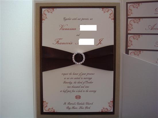
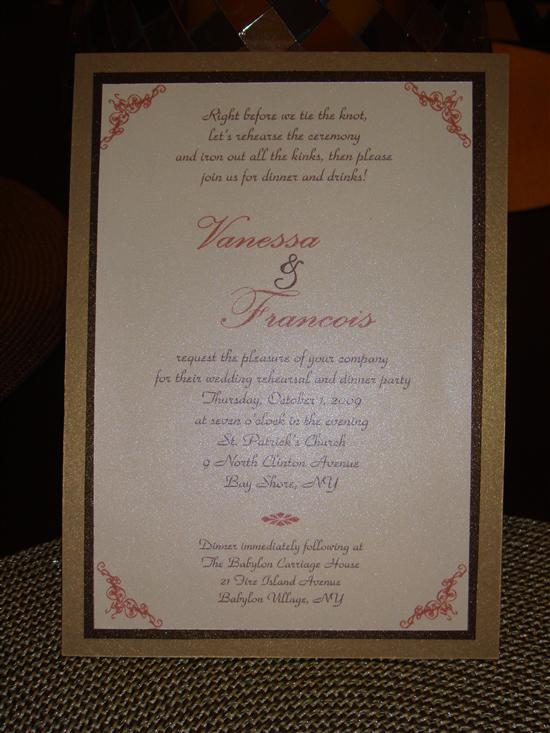
Our invites were not DIY but I kind of made a reproduction of them for our RD invites, programs, menus, favor tags, etc. On our RD invites I used 2 different fonts in two different colors. Our names were in one font and the rest of the invite in another font. The font size really depends on the actual font. The smaller font (ParkAvenueBT) was 14pt. the larger font (PalaceScriptSemiBold) was 48 pt. Here's pics of both invites:

Invites (not DIY):


RD Invites (DIY):

Reply to this topic

Log in to reply or quote a post.