
Member since
Honest opinions on these monograms please!
Member since
Re: Honest opinions on these monograms please!
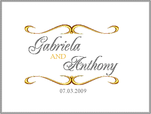
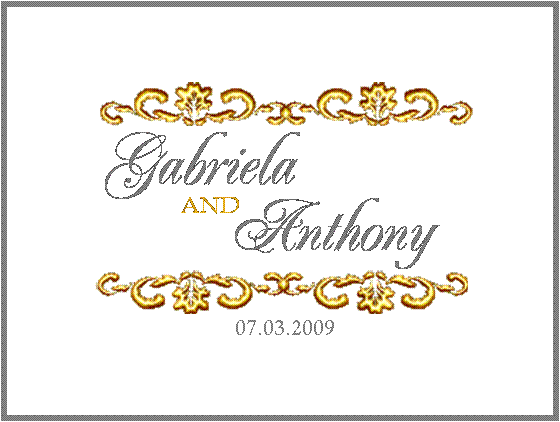
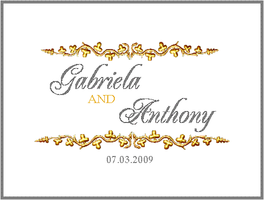
I like number one best, I think it makes it looks the most centered and balanced. For some reason, and maybe I'm just tired and my eyes are crossing lol, the second and third don't look entirely centered.
Member since
Re: Honest opinions on these monograms please!
Member since
Re: Honest opinions on these monograms please!
I like the 2nd one the best but the spacing looks a little off??
Member since
Re: Honest opinions on these monograms please!
I like the flourish on #1 but like the G font on # 2 better. What font did you use on #2?
Member since
Re: Honest opinions on these monograms please!
I love #1!!
Member since
Re: Honest opinions on these monograms please!
I like #2
Member since
Re: Honest opinions on these monograms please!
i like number 1 !!
Member since
Re: Honest opinions on these monograms please!
You can recolor other borders...Not sure what program you used but try finding a border you like and then recolor. I'm sure some LIW girls can help you out. I would suggest moving the and over. I think that is what throws the balance off. It's directly under your name.
Member since
Re: Honest opinions on these monograms please!
I picked #1
Member since
Re: Honest opinions on these monograms please!
I love #1. I think the scroll design makes it very elegant.
Member since
Re: Honest opinions on these monograms please!
Member since
Re: Honest opinions on these monograms please!
I like 1 the best!
Member since
Re: Honest opinions on these monograms please!
I like the first one.
Member since
Re: Honest opinions on these monograms please!
Member since
Re: Honest opinions on these monograms please!
Member since
Re: Honest opinions on these monograms please!
I like number 1 best
Member since
Re: Honest opinions on these monograms please!
I like the first and second ones
Member since
Re: Honest opinions on these monograms please!
I like # 1 as well...very nice!!

