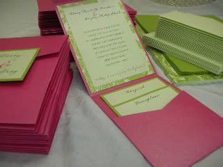
OK so after receiving my Evenstar sample I thought I was set with invitations, but then I started second guessing myself and wasn't sure I was ready to commit to these. After shopping around a little, FH is convinced that these are the best that we've seen and he wants to stick with them. I'm not sure why he has such strong feelings about our invitations, but he hasn't liked any others as much! Anyway, this is where you girls come in. Would you mind making suggestions on how we can make this invitation better? Colors? Font? Wording? Any suggestions are greatly appreciated! TIA!
ETA: I've posted these before but I'm just posting them again for any suggestions you might have.
kristentinnelly
Posted:
Member since
Re: Invitation help (w/ pics)
I love them...I'm with FH on this one. The look great!!!
BarbieGrl10
Posted:
Member since
Re: Invitation help (w/ pics)
I hope this posts... Its pretty similar to the tessa one.
They are from paperpersuasions.com
HotAir
Posted:
Member since
Re: Invitation help (w/ pics)
I think it is perfect! I LOVE your invitation!!!
stefandken
Posted:
Member since
Re: Invitation help (w/ pics)
i love them!
MrsList09
Posted:
Member since
Re: Invitation help (w/ pics)
I would only suggest a different ribbon. Otherwise I think it's gorgeous. I'm a Tessa bride too and now when I look at other invitations, they look so plain and generic to me. So I would definitely stick with this invite.
BarbieGrl10
Posted:
Member since
Re: Invitation help (w/ pics)
Posted by Future Pepper
Thanks girls! The metallic paper might be a good idea! I'm just worried it's going to raise the price and these are already more than I was hoping to spend on something that's get thrown in the trash LOL
Posted by BarbieGrl10
Bonnie... what exactly dont you like about them?
Barb, I think I'm just being too picky. I wasn't even this picky about my wedding gown! But I'm not sure I love how dark the grapes are and how dark the green ribbon is. The color green we're using for our wedding is a lot lighter (think: green grapes). Also, the color of the font is green but on the font in the RSVP (accepts/declines) it's black. I think it looks awkward. Do you see it? Or you could totally just tell me to shut up and stop overthinking things. LOL
I agree about the ribbon. I cant really see that the text is black from the pic....it kind of looks like that dark green color. Maybe ask her to change it to the lighter green?
lauraandrob2009
Posted:
Member since
Re: Invitation help (w/ pics)
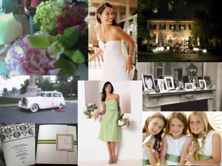
Ok, well you know I LOVE them because I even added them to my inspiration board
But I agree about the green ribbon on the inside - color seems off from all the others. That would be the only thing I might adjust. Otherwise I think it is beautiful!!
I agree Bonnie, I think the font needs to be the same color as the invitation, the black seems awkward. Also, I agree with the other girls about the ribbon, can she change it to light green to match the other green on the invite? I really like the rest of it, I don't think you need metallic paper, it looks pretty in the paper that was used...HTH
allegracristina
Posted:
Member since
Re: Invitation help (w/ pics)
They're gorgeous Bonnie! I wouldn't change anything!
vicky1125
Posted:
Member since
Re: Invitation help (w/ pics)
i think they're great the way they are.
Im a Pepper
Posted:
Member since
Re: Invitation help (w/ pics)
Posted by MLAngelo
I loved it but its obvious you don't so my moms a graphic artist so I showed her. Hope you don't mind.
She thinks the problem is the ribbon, that dark green on the outside is adding another color randomly, other then the ribbon (and the lines that obviously match the ribbon), that color is no where else in the invite which throws off your eye (the way you read the invitation). Her suggestion is to either make the ribbon, and the lines on each page, either the solid light green, pink and green, or solid pink. But keep to the main color scheme rather then randomly adding the dark green.
Thanks for showing your mom! I definitely value a graphic artists' opinion. And I totally agree with her and some of the other girls about the ribbon being too dark - it's throwing everything off! I'm thinking of asking her to try either a lighter green or pink. Thanks again!
Im a Pepper
Posted:
Member since
Re: Invitation help (w/ pics)
Posted by lauraandrob2009
Ok, well you know I LOVE them because I even added them to my inspiration board
But I agree about the green ribbon on the inside - color seems off from all the others. That would be the only thing I might adjust. Otherwise I think it is beautiful!!
Laura, I'm really really flattered that you put my invite on your inspiration board! That is sooo sweet! I'm definitely going to ask Tessa to change the ribbon and see how it goes. It's kind of annoying to move forward with more changes because it'll probably take a month to get another proof Oh well, that's the price I'll pay for perfection!
FutureMrsWildes
Posted:
Member since
Re: Invitation help (w/ pics)
Honestly, I wouldn't change a thing!
Jsquared279
Posted:
Member since
Re: Invitation help (w/ pics)
THESE ARE AMAZING!!!!!!!!!! I love them!
littlepixie12
Posted:
Member since
Re: Invitation help (w/ pics)
I love them Bonnie, I wouldnt change a thing
MrsCtobe
Posted:
Member since
Re: Invitation help (w/ pics)
wow, those are beautifully done and very unique! luv it =-)
azailia
Posted:
Member since
Re: Invitation help (w/ pics)
You could make the pocket pink metallic!!! i love them btw!!
sofreakingexcited
Posted:
Member since
Re: Invitation help (w/ pics)
I wouldn't change anything! They are so pretty Bonnie!
Lisa218
Posted:
Member since
Re: Invitation help (w/ pics)
I would change the ribbon and leave the rest the way it is. They are super gorgeous!!