Post New Topic

Invitation Pictures!

LouMar2010 Posted:

Invitation Pictures!

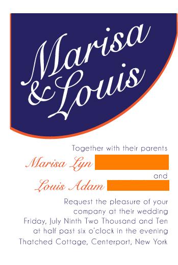
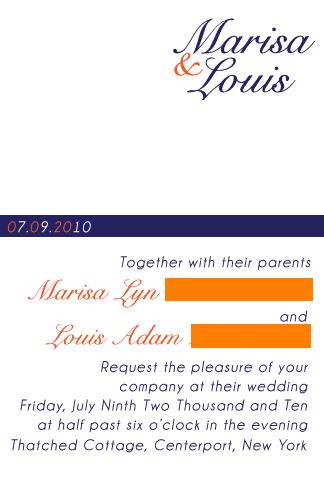
Our best mans friend is a graphic designer and is doing our invitations for us. She emailed me some designes based on invitations i liked. i narrowed them down to these two. which one do you like.

to keep with out hockey theme we are putting velum over it with scrapes on it to look like an ice rink...
mosh424 Posted:

Re: Invitation Pictures!

i think i like the second one better

Lsorrent Posted:

Re: Invitation Pictures!

I like number 2
20mrsc10 Posted:

Re: Invitation Pictures!

i like number 2 better however
imo they're not really 'wedding' invitations..they seem very very casual between the font and the lay out..is there anyway to make them seem more formal? jmo
Jna2010 Posted:

Re: Invitation Pictures!


Posted by 20mrsc10

i like number 2 better however
imo they're not really 'wedding' invitations..they seem very very casual between the font and the lay out..is there anyway to make them seem more formal? jmo


I agree sorry jmho...but either one I would center the wording
LouMar2010 Posted:

Re: Invitation Pictures!

the invitations are going to be panel invitations, so it will have a the layer shown on top of blue and orange paper. not jsut a single piece. and the vellum on top of that tied with a bow... still working out the final details...
thanks for you opinions, but i like a more causual and simple feel for the wedding invitations. its a friday night in the summer and i want everything summery and bright...
Nina1010 Posted:

Re: Invitation Pictures!

I like #2....simple, lighter and nice.

JoanneAndJustin Posted:

Re: Invitation Pictures!

Number two... and I would still center it.

And I don't think I would scratch the vellum... it'll still give it the same feel without the scratches.
RitasEngaged Posted:

Re: Invitation Pictures!


Posted by 20mrsc10

i like number 2 better however
imo they're not really 'wedding' invitations..they seem very very casual between the font and the lay out..is there anyway to make them seem more formal? jmo


ita
tiffanykiss Posted:

Re: Invitation Pictures!

I like # 2

elisa112101 Posted:

Re: Invitation Pictures!


Posted by RitasEngaged


Posted by 20mrsc10

i like number 2 better however
imo they're not really 'wedding' invitations..they seem very very casual between the font and the lay out..is there anyway to make them seem more formal? jmo


ita


ITA2 I think the first one looks like a resaurant sign... #2 is better
GR2010 Posted:

Re: Invitation Pictures!

I like #2 the best... The first one doesn't really say 'wedding' to me...

Clover23 Posted:

Re: Invitation Pictures!

2ND one

Reply to this topic

Log in to reply or quote a post.