
Member since
Invitation Revision
Member since
Re: Invitation Revision
Member since
Re: Invitation Revision
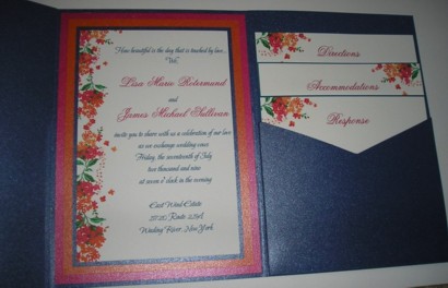
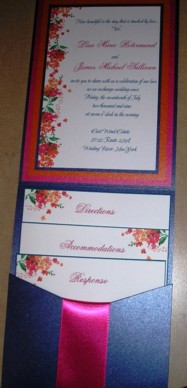
I like the horizontal invite but I like the new one with the ribbon. I brakes up the blue. Is there a way tp put the ribbon on the first one.
Member since
Re: Invitation Revision
I thought of that at first but I don't think the ribbon woudl flow with the first one. I think with the second layout it appears like it is a continuation from the way it is wrapped (if that makes any sense).
Member since
Re: Invitation Revision
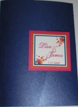
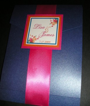
i like the first pic shown, but the front i like it with the ribbon!
Member since
Re: Invitation Revision
I like the first one better.
Member since
Re: Invitation Revision
I like the first one better
Member since
Re: Invitation Revision
Why does everyone like the first one better? lol it's so funny because I was thinking that it was too folder like and thought changing the direction and adding a ribbon would be better. no?
Member since
Re: Invitation Revision
Member since
Re: Invitation Revision
the new one i agree with you
Member since
Re: Invitation Revision
I like the layout of the first one better, but agree that it's a lot of blue. Can they incorporate a narrower ribbon or detail to break it up a bit?
Member since
Re: Invitation Revision
Member since
Re: Invitation Revision
Member since
Re: Invitation Revision
I love the new one!
Member since
Re: Invitation Revision
i like the ribbon but i like the horizontal layout better.
Member since
Re: Invitation Revision
I honestly like the first one better...it's cleaner.
Member since
Re: Invitation Revision
Member since
Re: Invitation Revision
Member since
Re: Invitation Revision
Member since
Re: Invitation Revision
I like the ribbon...I think it gives it a nice touch!

