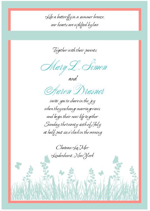
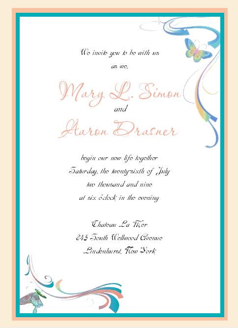
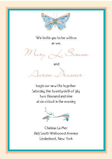
Hi! I just got a draft of my invitation and I am trying to decide which one I like best. My colors are tiffany blue and white with coral accents and my theme is butterflies.
So which do you prefer? 1, 2 or 3
What changes do you think would make this more attractive. I like the designs but they still don't seem exactly what I want... its like they are missing something..... hmmmm....
I like the colors and style of the first invite. I'm not sure if I love the gap in it though....maybe they could change that? JMO
KimberlyScott
Posted:
Member since
Re: Invitation which do you prefer??
Love #1
bluegreen08
Posted:
Member since
Re: Invitation which do you prefer??
love your colors, but i prefer more traditional invites. some of the pictures look a little like clip art..
PreshusSmurf
Posted:
Member since
Re: Invitation which do you prefer??
Posted by bluegreen08
love your colors, but i prefer more traditional invites. some of the pictures look a little like clip art..
i agree .... they 'clip art' style of artwork makes them look a bit DIY-ey (is that a word? ), even if they aren't.
also, not really a fan of the font combinations personally.
Aug07OFCbride
Posted:
Member since
Re: Invitation which do you prefer??
definitely the 1st!!! i love the butterflies btw. the first, to me, is the most classy and simple and elegant. the others, im not crazy about the design or colors, little cheesy looking (i second the clipart thing with 2 and 3). sorry, dont want to sound harsh but that was my honest initial thought.
Sharron70
Posted:
Member since
Re: Invitation which do you prefer??
I love the design of (and chose) # 1 but I'm just not keen on the colours - gives me a real 'baby shower' feel.
I'm sorry
Beautiful job on all 3 though!
bensgirl
Posted:
Member since
Re: Invitation which do you prefer??
i definitely like #1 best! i agree with the previous posters about the 'clip art' feel of the second and third designs and about the fonts. it may look more 'clean' if they don't use a script font for the wording, only for your names. and, do you want it to say the year along with the month and day? i think it's beautiful and i love that you are doing something non traditional!!! :)
bigrd37
Posted:
Member since
Re: Invitation which do you prefer??
Posted by TiffJoey
I like the colors and style of the first invite. I'm not sure if I love the gap in it though....maybe they could change that? JMO
i agree about that line. it breaks it up too much.
mls282
Posted:
Member since
Re: Invitation which do you prefer??
Thanks! My theme is butterflies and I just didn't find anyones that I loved online so I contacted someone that was recommended on here. I like them but I just don't t love the samples. I do want it to feel less clip arty and more classy/elegant. ANy suggestions on how to do this? None of these is the final product these are just mockups.
bensgirl
Posted:
Member since
Re: Invitation which do you prefer??
i did a quick google search and saw this....i think the fact that the butterflies look more 'real' make it more elegant. i hope that makes sense...in other words, they don't seem so much like clip art. and, it shows what i was saying about the fonts. also, maybe leave your paper white and do the butterflies in blue and the writing in peach or some combo like that so you still have all of your colors but not so much of them. i really love the idea of your invite! i hope this helps! :)
mls282
Posted:
Member since
Re: Invitation which do you prefer??
Posted by bensgirl
i did a quick google search and saw this....i think the fact that the butterflies look more 'real' make it more elegant. i hope that makes sense...in other words, they don't seem so much like clip art. and, it shows what i was saying about the fonts. also, maybe leave your paper white and do the butterflies in blue and the writing in peach or some combo like that so you still have all of your colors but not so much of them. i really love the idea of your invite! i hope this helps! :)
Oooo... I like that sooo much better. I am trying to explain to her what I mean but I am not doing a good job. I like this alot. For some reason my computer does not let me right click and save it. Would you be able to email it to me. I will fm you. THANKS!!!!!!!!
bensgirl
Posted:
Member since
Re: Invitation which do you prefer??
hi...just saw your FM....i actually just found the image through google, but it looks like it's from a UK design company. here is the link to their website with the full line:
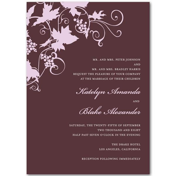
I sent her the picture of the butterfly one ben's girl posted and this one. Since I like the graphic on that one but the layout and font of this one. I just need it in my colors Tiffany blue and white. Hopefully that will give her a better idea of what I am looking for.
I feel like the color she is using isnt tiffany blue either... more seafoam green??? I am not sure. UGH!!!
mls282
Posted:
Member since
Re: Invitation which do you prefer??
Sorry this is one I sent... Ilike the layout and font.
I like the first one, I think it looks the most formal. I kind of feel like the other two look like for a communion or something for a little girl. JMO
mls282
Posted:
Member since
Re: Invitation which do you prefer??
Posted by stinenandy2010
I like the first one, I think it looks the most formal. I kind of feel like the other two look like for a communion or something for a little girl. JMO
I know what you mean. I think it might look better with black and tiffany blue... then with the coral color.