MikesBride2B
Posted:
Member since
Invitations
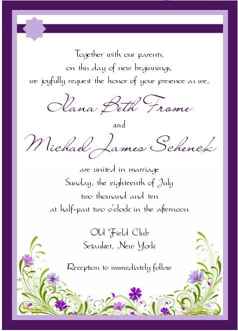
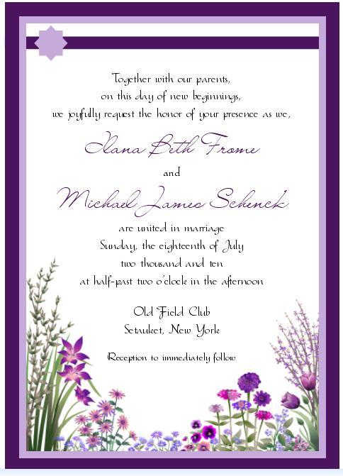
Please help me!! I love them both!! I will probably tweak either one a little bit, but that will come after I choose one haha.
The line across the top is a ribbon and that weird shape thing is a flower or embellishment of some kind.
The theme was 'Organic Whimsy' if that helps
ETA: Just consider designs right now...I think I'm going to end up changing the font either way
![]()
Option 1

Option 2

SummerBride10
Posted:
Member since
Re: Invitations
I like option 1 much better. In the second one, its hard to read your names with that font. However, on both the bottom design is really nice.
20mrsc10
Posted:
Member since
Re: Invitations
i love #2, but im not too sure about the fonts
MikesBride2B
Posted:
Member since
Re: Invitations
Posted by 20mrsc10
i love #2, but im not too sure about the fonts
Yeah...I think that's going to be part of the tweaking that I do, not sure....but I love both designs so the font has to come second haha
Future Mrs H
Posted:
Member since
Re: Invitations
I like the flowers on # 2 but not too crazy about the font for your names
jayepyt
Posted:
Member since
depoc1011
Posted:
Member since
Re: Invitations
i really like the 'design' of #2....i feel like it matches the OFC perfectly too!
Rosalind_75
Posted:
Member since
Re: Invitations
i love # 1 !!!!!!!!!!!!!!!
the green pops out more to me !!!!!!!!!!!!!!!!!
im so excited that you got the mock ups !!!!!!!!!
MrsC2010
Posted:
Member since
Re: Invitations
i voted for #2 bc i like the flowers better!
AngnShaun
Posted:
Member since
Re: Invitations
i love the font... but i think there is to much going on on the bottom...
tmcnair414
Posted:
Member since
Re: Invitations
My vote is for # 2
LaurenJosh
Posted:
Member since
Re: Invitations
I like the first one!
TessMike621
Posted:
Member since
Re: Invitations
i picked #2 because i feel like it fits the old field club vibe...i think #2 is really cute
Kiki1103
Posted:
Member since
Re: Invitations
I like 1 alot!
RachelandJimmy
Posted:
Member since
cateydee
Posted:
Member since
Re: Invitations
i like 1 but im not crazy about the star of david-like design on top
MikesBride2B
Posted:
Member since
Re: Invitations
Posted by cateydee
i like 1 but im not crazy about the star of david-like design on top
Its just a place marker...there's gonna be some kind of flower or embellishment there
![]()
cateydee
Posted:
Member since
Re: Invitations
Posted by MikesBride2B
Posted by cateydee
i like 1 but im not crazy about the star of david-like design on top
Its just a place marker...there's gonna be some kind of flower or embellishment there ![]()
oh der. i guess i should read closely
FutureMrsSoltan
Posted:
Member since
Re: Invitations
i love both designs on the bottom ..... but if i had to pick i would pick the 1st one
scatteredx12
Posted:
Member since
Re: Invitations
i think both are so nice.. but i think i'm leaning towards #2.