Re: Invite Font Poll
I like one. I like how it looks with non-script text and script names. That's how ours is.

Search in your own words. Describe what you need or ask a wedding planning question.
please help! which font do you like best for the text (not the names). TIA!! sorry the first one is much smaller than the others... dunnno why
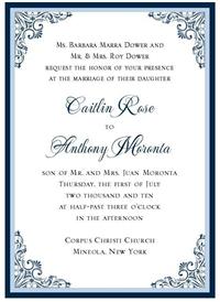
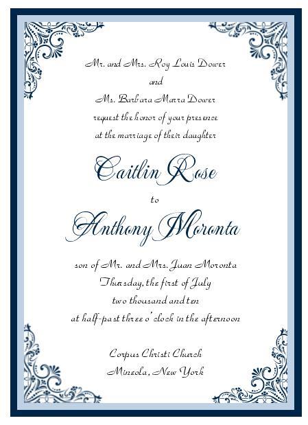
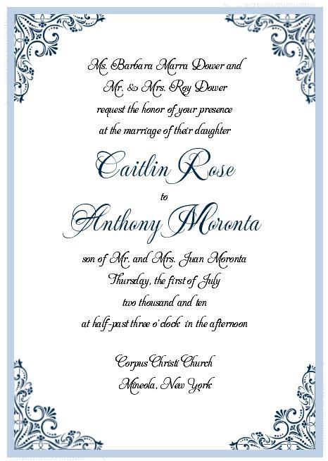
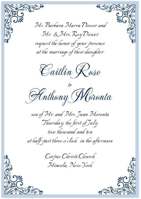
I like one. I like how it looks with non-script text and script names. That's how ours is.
3..love the way it fits the whole invite (swirly)
def #1
I was torn between 1 and 3 (but liked 4 also!) Three is most similar to the middle font, and I like that it flows (thats the one I voted for) but I also really like the contrast of the block letters, however there was something about that lettering that made me think the card was yelling at you. Four seemed to be a bit different so more contrast than #3 but not as much as #1, but then when I looked at it closely it was too much of a different font... lol. see why i drive myself crazy too!?
I like #3 and #4
i like 1 and 3... i voted for 1 because i like having just the names stand out in script, but both are pretty
3
#1- I'm biased though as that looks very similar to how I printed mine out!
4 is the easiest to read while still matching your invitation.

