
Member since
My invites...in progress OPINIONS PLEASE

Member since
Re: My invites...in progress OPINIONS PLEASE
no pic?
Member since
Re: My invites...in progress OPINIONS PLEASE
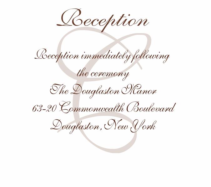
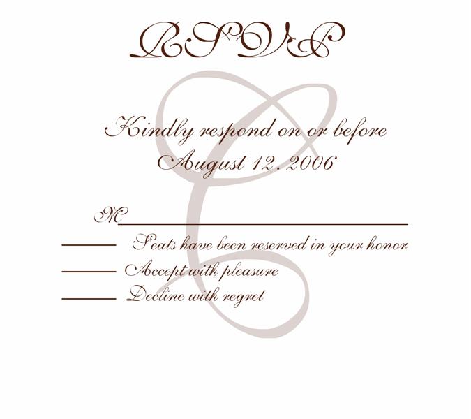
I love them....I think the watermark only adds....doesn't take anything away
Member since
Re: My invites...in progress OPINIONS PLEASE
I thing it looks very elegant.
Member since
Re: My invites...in progress OPINIONS PLEASE
Member since
Re: My invites...in progress OPINIONS PLEASE
I think the watermark is perfect!
Member since
Re: My invites...in progress OPINIONS PLEASE
Nice but put some spacing in between the date and the RH.
Member since
Re: My invites...in progress OPINIONS PLEASE
I really like it, they look very elegant!
Member since
Re: My invites...in progress OPINIONS PLEASE
I really like them...and I think the watermark is a nice touch.
Member since
Re: My invites...in progress OPINIONS PLEASE
Member since
Re: My invites...in progress OPINIONS PLEASE
Member since
Re: My invites...in progress OPINIONS PLEASE
very pretty-how did you do that?? I would put a space between the date and reception place too if you can(although I wouldnt have noticed if someone else didnt point it out)
Member since
Re: My invites...in progress OPINIONS PLEASE
very nice! the watermark is very elegant
Member since
Re: My invites...in progress OPINIONS PLEASE
Member since
Re: My invites...in progress OPINIONS PLEASE
Member since
Re: My invites...in progress OPINIONS PLEASE
Member since
Re: My invites...in progress OPINIONS PLEASE
Love it! If you think it's distracting, maybe make it a bit lighter?
Member since
Re: My invites...in progress OPINIONS PLEASE
I think it looks great, space or no space!
Member since
Re: My invites...in progress OPINIONS PLEASE
I don't find it distracting at all I think it looks very nice.
Member since
Re: My invites...in progress OPINIONS PLEASE
I love your invites and I think the watermark adds lots of elegance to them

