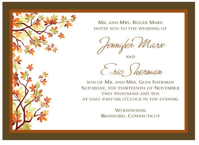
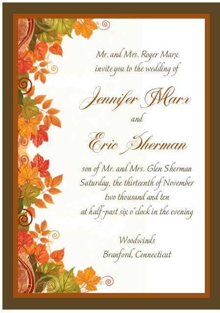
I got my 2 prelim designs today...I'm not so nuts about them. What do you girls think? I feel like something is missing, but I'm not sure what.
AngnShaun
Posted:
Member since
Re: my prelim designs...
i like the design of 1 but the font of 2.... they are both great tho
elp6421
Posted:
Member since
Re: my prelim designs...
I really like the 2nd one but I do agree it needs something else. Is there anything that could punch up your names a little bit?
MikesBride2B
Posted:
Member since
Re: my prelim designs...
I really like the first one better, but IA there is something missing...someone said something about possibly making the leave metallic, I think that is a great idea...although that'll probably jack the price right up.
FutureCap
Posted:
Member since
Re: my prelim designs...
love #2!
StaceyWill
Posted:
Member since
Re: my prelim designs...
I love the 2nd one!!
kris_gets_hitched
Posted:
Member since
Re: my prelim designs...
I like the first one more.
Something about the second one seems kind of 70's to me...maybe it's the color combo or something, I can't quite place it.
I think it needs a little sparkle or glitter to make it pop. (The first one, I mean). Or maybe a slightly lighter outer border?
I'm kind of stumped here.
sophisticat13
Posted:
Member since
Re: my prelim designs...
Crashing...I love to look at 'crafty' things :) I like the 2nd one but I think what is missing is some bling...like some gold foil accents to go with the autumn theme???