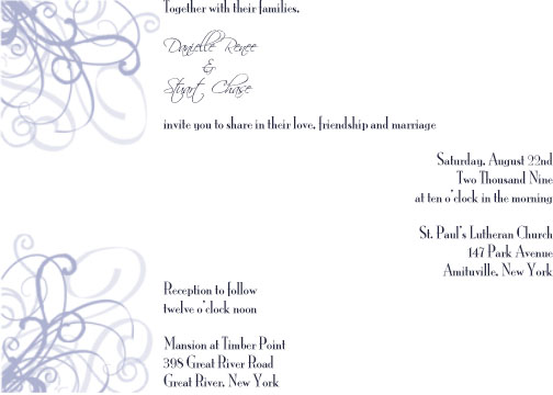
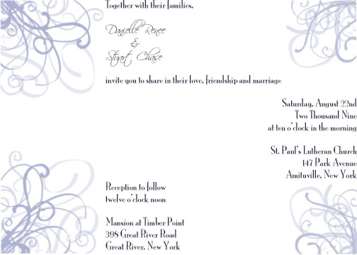
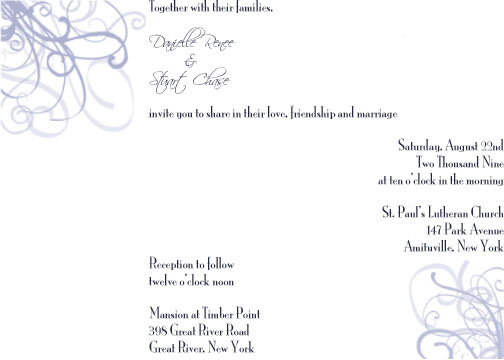
hate to say it but theres something about it that i dont think looks good... you may need to put the designs diagonal instead to make the flow of thw writing look better
EmiNoa628
Posted:
Member since
Re: possible invite design
I want to tell you it looks good.. But there is something about it that doesn't look like it should!! I want to tell you it looks beautiful but if you love it then I agree with you!!
LeeAnne
Posted:
Member since
Re: possible invite design
i agree with making the design in opposite diagonal corners. and maybe have the writing all be centered
MrsDrinkh20
Posted:
Member since
Re: possible invite design
I like the idea of it but i dont like the writing that far off centered..i actually thought it was just a loading error..woops! I think the designs are beautiful and the colors are pretty!
NikkiR515
Posted:
Member since
Re: possible invite design
I think the design and colors are beautiful but I would probably put the designs diagonal from each other and put the writing in the middle but that is JMO.
VickiR510
Posted:
Member since
Re: possible invite design
I have to agree teh writing off like that doesnt look right. Maybe just one flourish & thats it. Or diagonal or maybe even the two in the top corners????? Just an idea.
Also why families & not parents? Unless there is a reason then that would be fine. Like Divorce or deceased.
ddnsp618
Posted:
Member since
Re: possible invite design ***with another design**
Posted by VickiR510
I have to agree teh writing off like that doesnt look right. Maybe just one flourish & thats it. Or diagonal or maybe even the two in the top corners????? Just an idea.
Also why families & not parents? Unless there is a reason then that would be fine. Like Divorce or deceased.
my dad passed, and we are paying for the wedding ourselves, no help from either...so we thought it would just be easier...
i made these myself....im just trying a bunch of different options idk if this is going to work though.
jennaandguy09
Posted:
Member since
Re: possible invite design ***with another design**
I think you should center the writing, with the one paragraph all the way to the right, it seems like something is off... but as the rest of the girls have said if you love it then totally go for it@
MrsDrinkh20
Posted:
Member since
Re: possible invite design ***with another design**
Posted by ddnsp618
Posted by VickiR510
I have to agree teh writing off like that doesnt look right. Maybe just one flourish & thats it. Or diagonal or maybe even the two in the top corners????? Just an idea.
Also why families & not parents? Unless there is a reason then that would be fine. Like Divorce or deceased.
my dad passed, and we are paying for the wedding ourselves, no help from either...so we thought it would just be easier...
i made these myself....im just trying a bunch of different options idk if this is going to work though.
wow good job danielle! I like the first better than the second..i think the second is too busy, but i think id like the writing all centered..but thats jus tme! if you love them go for it!
gina409
Posted:
Member since
Re: possible invite design ***with another design**
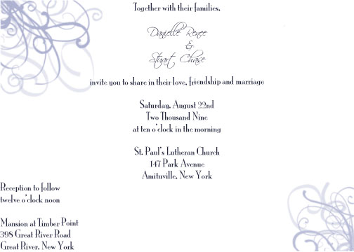
i like the last one best..u did it on ur own?good job i wish i could do that
LeeAnne
Posted:
Member since
Re: possible invite design ***with another design**
i like the fourth one with the design in the two diagonal corners. i still think it looks off with the uneven writing. how about only having the ceremony info on the invite and the reception information on a separate card. thats how mine are. JMO
ddnsp618
Posted:
Member since
Re: possible invite design ***with another design**
Posted by LeeAnne
i like the fourth one with the design in the two diagonal corners. i still think it looks off with the uneven writing. how about only having the ceremony info on the invite and the reception information on a separate card. thats how mine are. JMO
im trying to save the planet! ill play around with it some more and im looking all over to see if i will just buy them from wedding paper divas
LeeAnne
Posted:
Member since
Re: possible invite design ***with another design**
Posted by ddnsp618
Posted by LeeAnne
i like the fourth one with the design in the two diagonal corners. i still think it looks off with the uneven writing. how about only having the ceremony info on the invite and the reception information on a separate card. thats how mine are. JMO
im trying to save the planet! ill play around with it some more and im looking all over to see if i will just buy them from wedding paper divas
way to be eco friendly danielle!
ddnsp618
Posted:
Member since
Re: possible invite design ***with another design**
Posted by LeeAnne
Posted by ddnsp618
Posted by LeeAnne
i like the fourth one with the design in the two diagonal corners. i still think it looks off with the uneven writing. how about only having the ceremony info on the invite and the reception information on a separate card. thats how mine are. JMO
im trying to save the planet! ill play around with it some more and im looking all over to see if i will just buy them from wedding paper divas
way to be eco friendly danielle!
....alllllll day
FuTuRe MrS MaZz
Posted:
Member since
Re: possible invite design ***with another design**
what about putting the design in the upper right hand corner and another in the lower left hand corner... and put the writing diagonal from upper left to lower right? LOL i hope you're a visual person to understand that i pretty much described how mine are
ETA: With my idea, you'd have to print the invite vertical instead of horizontal so you have more room to work with
lauraandrob2009
Posted:
Member since
Re: possible invite design ***with another design**
I'm so sorry about your Dad...that is so tough (mine passed 3 years ago) - I think these are a great start. I like the idea of maybe one flourish on one side and the text on the other - would like to see it that way. Of these posted, my favorite is the last though I would drop the text in the center down a little bit.
FutureMrsM
Posted:
Member since
Re: possible invite design ***with another design**
hmm, the print looks too close to the top and edges, something about it doesn't look right...