
Member since
She Who Not be Named - 1st Run

Member since
Re: She Who Not be Named - 1st Run
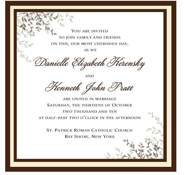
theres on;y 1 pic here but i like it very pretty!
Member since
Re: She Who Not be Named - 1st Run
they are pretty but i think it needs more green!
Member since
Re: She Who Not be Named - 1st Run
I asked her to change the border to green and to give me some leaves on top instead of on the sides.
Member since
Re: She Who Not be Named - 1st Run
Member since
Re: She Who Not be Named - 1st Run
Member since
Re: She Who Not be Named - 1st Run
It needs more green!
Member since
Re: She Who Not be Named - 1st Run
It's a good start - very pretty!
Member since
Re: She Who Not be Named - 1st Run
Member since
Re: She Who Not be Named - 1st Run
Sorry now the 2nd one is up I didnt realize I posted the same one twice
Member since
Re: She Who Not be Named - 1st Run
i like the second one better but like everyone else said, it needs more green
Member since
Re: She Who Not be Named - 1st Run
Member since

