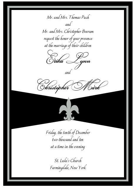
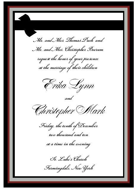
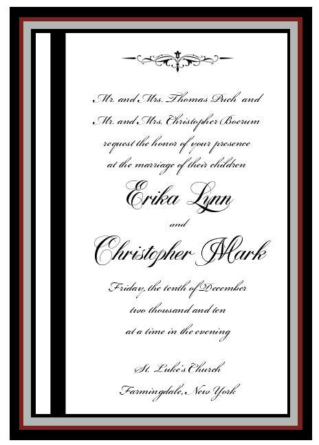
Just got my computer mock ups for my invitations (which I have been so excited for) and I don't like them at all. I know it is just the first mock up but I don't even know where to go with them.....
kris_gets_hitched
Posted:
Member since
Re: So sad..
If you post them here we can make suggestions.
Jtruran
Posted:
Member since
Re: So sad..
maybe we can help????
happychelle
Posted:
Member since
Re: So sad..
Yes - post them - we can definitely help!
netsirk10
Posted:
Member since
Re: So sad..
i would love to see it!
SoontobeGallagher
Posted:
Member since
Re: So sad..
We are here to help!!
regy_k
Posted:
Member since
Re: So sad..
is it that the person doing them totally didnt get what u were going for? then try someone else if its just that something doesnt work ask for something else
its just the 1st version, nothing to worry about. my FH made about 3-4 versions before we set on a certain thing and then he kept redoing it and redoing it. it is a lengthy process
yea, i'm not loving it either. it is a bit plain. is that what you asked for?
elp6421
Posted:
Member since
Re: So sad..
no! I think its that and too much black.
netsirk10
Posted:
Member since
Re: So sad..
Posted by elp6421
no! I think its that and too much black.
yea, well maybe she just did not get what you wanted. def. tell her and see what she does the second time around. i also agree that there is too much black. maybe you could change the font color.
jme78
Posted:
Member since
Re: So sad..
I don't love any of the fonts. They seem a bit...severe. Makes it look more business-y rather than festive.
Can you try another font?
Clover23
Posted:
Member since
Re: So sad..
you need to tell her what you don't like - that way she can work with you to figure out what you DO like
elp6421
Posted:
Member since
Re: So sad..
maybe I will find one on her site that a like and ask her to work elements of that in
RitasEngaged
Posted:
Member since
Re: So sad..
yeah definately not feelong any of those
elp6421
Posted:
Member since
Re: So sad..
Ok so this is what I am thinking - less black, no red, and more silver and gold. I am going to work with the ribbon idea but script font for the names and regular for everything else.
Sorry, FH is just not into this at all and I feel compelled to share my ideas with someone!
halfbaked
Posted:
Member since
Re: So sad..
Posted by elp6421
Ok so this is what I am thinking - less black, no red, and more silver and gold. I am going to work with the ribbon idea but script font for the names and regular for everything else.
Sorry, FH is just not into this at all and I feel compelled to share my ideas with someone!
I was definitely thinking more silver, less black, and script only for the names. I think that'll help.