
Member since
tessa proofs please help ***added pics***


Member since
Re: tessa proofs please help
post some pics then we could help
Member since
Re: tessa proofs please help ***added pics***
added pics
Member since
Re: tessa proofs please help ***added pics***
I like the last one, with something added to the upper right corner.
Member since
Re: tessa proofs please help ***added pics***
I like the 2nd one, and you can add a design to the 'big hole' so that it wont look so empty, i think its a perfect space to add the design.
Member since
Re: tessa proofs please help ***added pics***
I like the first one or the 3rd one the best :)
Member since
Re: tessa proofs please help ***added pics***
Member since
Re: tessa proofs please help ***added pics***
I love the second one. And in the big hole you can add a nice design. I also like the idea to corner designs but I like a more structural design better.
Member since
Re: tessa proofs please help ***added pics***
i like the 1st!
Member since
Re: tessa proofs please help ***added pics***
I like #2 but adding a nice design there.
Member since
Re: tessa proofs please help ***added pics***
thanks girls...I still dno what to do....This give me a headache..
Member since
Re: tessa proofs please help ***added pics***
girls i am looking them again and wanted to ask you girls what if I take out our names the second time??? Since it is on the top why repeat?? Does the wording flow???
Member since
Re: tessa proofs please help ***added pics***
Member since
Re: tessa proofs please help ***added pics***
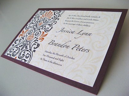
I like the second one too but what about some sort of print, instead of a picture of something...like this...
Member since
Re: tessa proofs please help ***added pics***
what u mean print??? the paper of the design on side???
Member since
Re: tessa proofs please help ***added pics***
I dunno... it seems a little too simple to me and needs something.... I just wanted to be honest and didnt want to just say I love it... when its just ok
Member since
Re: tessa proofs please help ***added pics***
Member since
Re: tessa proofs please help ***added pics***
i like the 4th one the best. but maybe use a monogram at the top instead of your names
Member since
Re: tessa proofs please help ***added pics***
i like the first one, but yea it needs something- like a design in the corner... and i also like the saying that is on the last one on the bottom- thats cute. maybe you can combine those two things....
Member since

