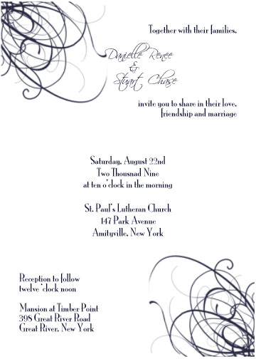
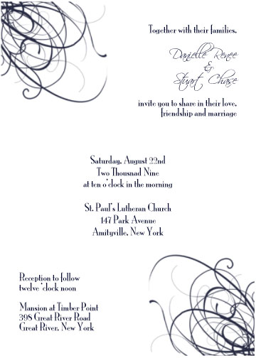
I think the 2nd one is beautiful!! I like thing symmetrical and I feel the placement of everything flows nicely!!
Great Job on them.
Summertimegal424
Posted:
Member since
Re: two new invites
wait tessa did those or you did?
cause if you did? they rock
ddnsp618
Posted:
Member since
Re: two new invites
Posted by Summertimegal424
wait tessa did those or you did?
cause if you did? they rock
i did them..i taught myself photoshop
Summertimegal424
Posted:
Member since
Re: two new invites
Posted by ddnsp618
Posted by Summertimegal424
wait tessa did those or you did?
cause if you did? they rock
i did them..i taught myself photoshop
very nice! love em
FuTuRe MrS MaZz
Posted:
Member since
Re: two new invites
hahah this is the exact suggestion i had made in your other thread....well almost.... i think its easier on the eyes to read from left to right instead of right to left.... you may wanna try switching it around and see hwo it looks
Soon2BMrsC09
Posted:
Member since
Re: two new invites
I think they are gorgeous! only thing i would change would be to make your names bigger - like to really POP
gina409
Posted:
Member since
Re: two new invites
they look great!!!!!!! u might have found a new careeer
LeeAnne
Posted:
Member since
Re: two new invites
so great danielle! symmetrical AND eco friendly!
love # 2
MrsDtoBe09
Posted:
Member since
Re: two new invites
Posted by Jennmolloy
I think the 2nd one is beautiful!! I like thing symmetrical and I feel the placement of everything flows nicely!!
Great Job on them.
I agree. Great job Danielle!
coldasice217
Posted:
Member since
Re: two new invites
I like the second one better in terms of the flow, but I would mess around with the font a bit more. It seems hard to read to me, but it may just be my monitor or bad eyesight. Regardless, great job!
MrsGRod09
Posted:
Member since
Re: two new invites
Number 2 is really great nice flow, it doesnt make your eyes jump around so much..
VickiR510
Posted:
Member since
Re: two new invites
Def #2 Its pretty! Good job D!
Celeste617
Posted:
Member since
Re: two new invites
I think #2 is the nicer of the two.
FYI - I noticed that the 'o' for 'o'clock' is missing at the bottom under Reception to Follow. No need for me to point it out at this point, but just in case you use it I figured I'd let you know!
dazies1011
Posted:
Member since
Re: two new invites
Posted by MrsDtoBe09
Posted by Jennmolloy
I think the 2nd one is beautiful!! I like thing symmetrical and I feel the placement of everything flows nicely!!