
Member since
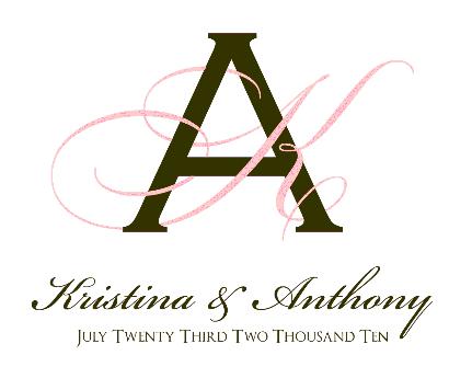
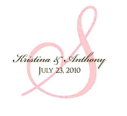
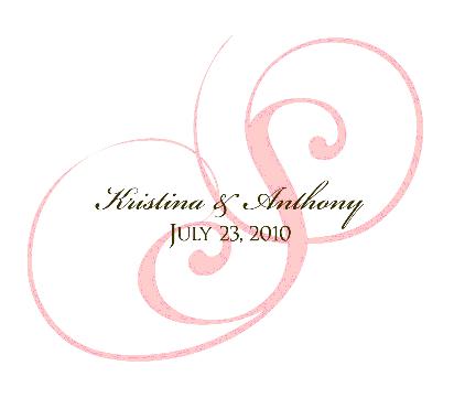
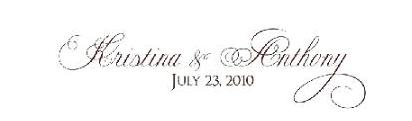
Unity candle help again....more proofs.
Member since
Re: Unity candle help again....more proofs.
i really like the third!!
Member since
Re: Unity candle help again....more proofs.
I also really like 3
Member since
Re: Unity candle help again....more proofs.
3
Member since
Re: Unity candle help again....more proofs.
I like the 3rd a lot!
Member since
Re: Unity candle help again....more proofs.
Bump for update with mom's thoughts. Not sure if I agree with her.
Member since
Re: Unity candle help again....more proofs.
I like the second one!
Member since
Re: Unity candle help again....more proofs.
Member since
Re: Unity candle help again....more proofs.
Member since
Re: Unity candle help again....more proofs.
i love 3
Member since
Re: Unity candle help again....more proofs.
I like the 3rd one
Member since
Re: Unity candle help again....more proofs.
who is the etsy seller?
Member since
Re: Unity candle help again....more proofs.
Member since
Re: Unity candle help again....more proofs.
i like the third one too..
Member since
Re: Unity candle help again....more proofs.
I like #3
Member since
Re: Unity candle help again....more proofs.
I like the 3rd one a lot
Member since
Re: Unity candle help again....more proofs.
I like #3, but I would like to see your names in a bigger font
Member since
Re: Unity candle help again....more proofs.
Member since
Re: Unity candle help again....more proofs.
Member since
Re: Unity candle help again....more proofs.
3

