
Member since
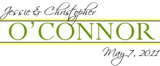
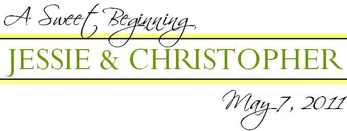
UPDATED: I think I may have finished our Monograms
Member since
Re: I think I may have finished our Monograms
Member since
Re: I think I may have finished our Monograms
Really pretty! But I would change the font for May unless you can do it lowercase. It looks kinda... wonky. LOL! But I love the layout and everything!
Member since
Re: I think I may have finished our Monograms
Member since
Re: UPDATED: I think I may have finished our Monograms
Member since
Re: UPDATED: I think I may have finished our Monograms
Member since
Re: UPDATED: I think I may have finished our Monograms
should I maybe shift our names over a little so that loop in the 'p' in christopher isn't overlapping the 'o' in o'connor?
Member since
Re: UPDATED: I think I may have finished our Monograms
Member since
Re: UPDATED: I think I may have finished our Monograms
Member since
Re: UPDATED: I think I may have finished our Monograms
good job!
Member since
Re: UPDATED: I think I may have finished our Monograms
this things being so damn fickle to post... give me a sec LOL
Member since
Re: UPDATED: I think I may have finished our Monograms
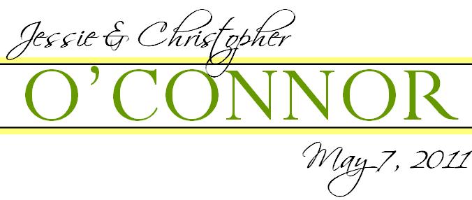
the spacing looks off for your names... maybe shift the names up a little more so the the spacing doesn't look awkward and uneven between the '&'
Member since
Member since
Re: UPDATED: I think I may have finished our Monograms
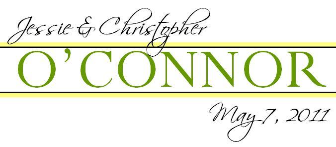
OK, I love the way the lowercase t looks int his font, but it makes the spacing funny... this is super intpicky, but the spacing between the o and t in Christopher irks me.... which is why I didn't choose that font with Channa because of the t and e in Steven... is that something that can be shifted?
Member since
Re: UPDATED: I think I may have finished our Monograms
Member since
Re: UPDATED: I think I may have finished our Monograms
Member since
Member since
Re: UPDATED: I think I may have finished our Monograms
Member since
Re: UPDATED: I think I may have finished our Monograms
anybody else have any other suggestions on the last one I posted... seriously, fire away!
Member since

