
Member since
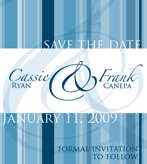
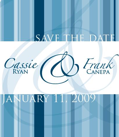
**UPDATED W/ NEW PROOF**Save the date proof..what do you think
Member since
Re: Save the date proof..what do you think?
I really, really like it - it's very pretty. I agree about the a/s thing, though...did you try playing with a different, but similar font? I love the font, but the a/s thing would bug me too if it was mine...
Member since
Re: Save the date proof..what do you think?
i lov it
Member since
Re: Save the date proof..what do you think?
i like it and didnt notice the font thing until i really gave it a good look.....maybe try a diff font? overall its looks awesome!
Member since
Re: Save the date proof..what do you think?
Member since
Re: Save the date proof..what do you think?
Member since
Re: Save the date proof..what do you think?
I really like it. Maybe if you use a different font you will like the way your name looks better. I honestly wouldn't have noticed it if you hadn't mentioned it.
Member since
Re: Save the date proof..what do you think?
WOW I love it, and the colors, it came out great. Iam going to pay that site a visit
Member since
Re: Save the date proof..what do you think?
I really really like it!!!! I didnt' notice the s thing until you pointed it out and then it still took me a minute to figure out what you were talking about. I would just ask the company to try and change the font so it won't do that but other than that they are Beautiful!!!!!
Member since
Re: Save the date proof..what do you think?
Member since
Re: Save the date proof..what do you think?
honestly, i am picky as all get out, and to me it looks pretty great. The 'formal invite' part looks fine as well....
Member since
Re: Save the date proof..what do you think?
Member since
Re: Save the date proof..what do you think?
you're right the font makes the a/s look a little funny in your name but other than that it looks fantastic!
Member since
Re: **UPDATED W/ NEW PROOF**Save the date proof..what do you think
yay for updates
Member since
Re: **UPDATED W/ NEW PROOF**Save the date proof..what do you think
its very nice!
Member since

