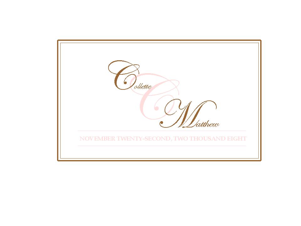
Please be honest and critical..this is the first one I made.Suggestions would be great...The pink will get washed out on a light background as will the brown on a dark background...don't know what to do with that!
it's really pretty...but I couldn't really see the pink lettering JMO. Can you use a darker shade of pink? Or maybe outline the pink in a darker pink, or even the brown?
Jkiesel
Posted:
Member since
Re: What do you think?
i like it, but can you make the pink darker a bit?
melissankurt07
Posted:
Member since
Re: What do you think?
I would try to make the pink a little darker. Maybe even outline the pink lettering. Otherwise it is very nice.
ratherbealeper
Posted:
Member since
Re: What do you think?
Honestly I don't know if you should go changing the colors... but why not make the 'important' stuff in brown and let the pink just be a soft detail almost like a watermark?
I'd switch the border to pink, keep the last initial in pink and go with the bold names and date in brown.
diva7531
Posted:
Member since
Re: What do you think?
I like it!!
GraceAndAdam
Posted:
Member since
Re: What do you think?
very pretty! But is it just me, or is the font for 'Collette' slightly smaller than the font for 'Matthew'?
MyLobster
Posted:
Member since
Re: What do you think?
Posted by GraceAndAdam
very pretty! But is it just me, or is the font for 'Collette' slightly smaller than the font for 'Matthew'?
I think you're right!
May2004
Posted:
Member since
Re: What do you think?
Love it!
How did you do that?
If you have some time, can you give me some instructions on how I go about creating one. I don't know where to begin. You could FM me if you like.
DrWho
Posted:
Member since
Re: What do you think?
It's very nice - dont' forget, it's lighter now because you're looking on a backlit monitor. Once you print it, it may look more substantial. I'd try it on white and on ivory.