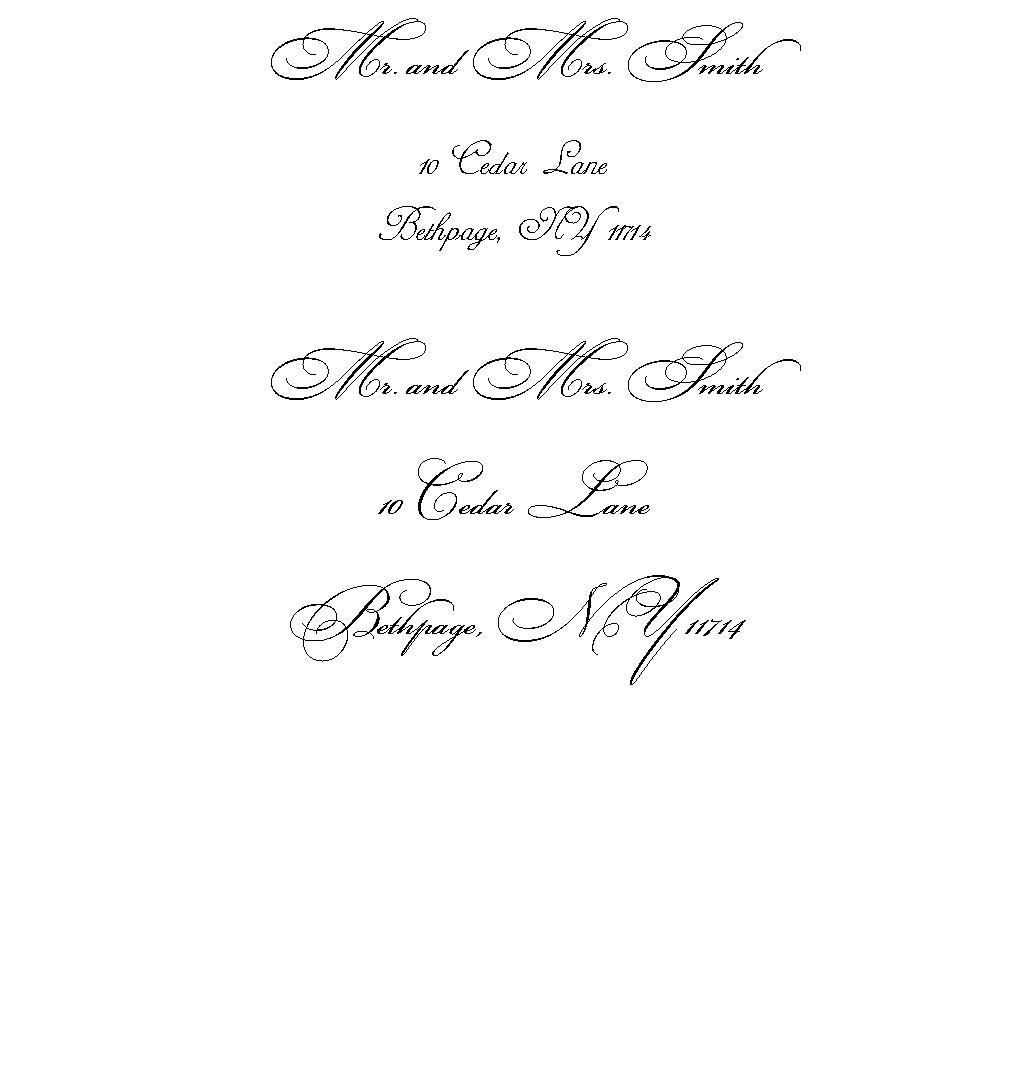
I like one better because the font is different between the name and the address...so it stands out more...makes the guest feel special. :) Just like your names on your invitation are in a different font and size than the rest of your invitation.
sophisticat13
Posted:
Member since
Re: Which one do you like
I like the first one a lot...the guest's name stands out
springsandra
Posted:
Member since
Re: Which one do you like
I like the one where the addressees names are the same size as the rest of the writing. Since the font is so flowery, I feel like otherwise the address gets lost.
Any reason you're not writing out 'New York'?
Cassie15
Posted:
Member since
Re: Which one do you like
The first one looks very elegant and vintage. I love it!
FutureMrsG
Posted:
Member since
Re: Which one do you like
I like the second one better.
drivwal
Posted:
Member since
Re: Which one do you like
first one
susannjames10
Posted:
Member since
Re: Which one do you like
#1
paprika023
Posted:
Member since
Re: Which one do you like
Posted by jussie82
2 but i think the ny is too big
ITA.. i like most of the second one.. just the NY is throwing me off
cavvento
Posted:
Member since
Re: Which one do you like
I think the second one looks too script-y for an address but I'm not sure I like the blend of those two fonts in the first. Did you try it out having all of #1 in the font you used for the address?