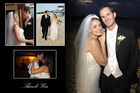
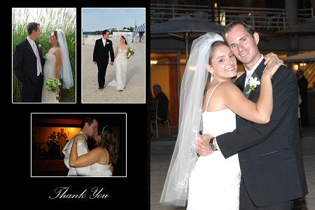
i'm finally getting around to this stuff and i got my proof from velvet today. i love the design, but i'm not sure i like the pictures i originally picked out. i threw it into photoshop and put different pics in and i think it like it better, but i'm not sure. what do you guys think?
#1 - original pics we picked out
#2 - pics I selected today
dgirl0114
Posted:
Member since
Re: help me pick a thank you
#2, you both look happier!!
Aug07OFCbride
Posted:
Member since
Re: help me pick a thank you
Posted by PeteysBride I like how that picture blends in a little more smoothly than the other. I think it makes it part of the background and then the other pictures on top just make it a nicer layout, as similar as they both are. #2 is also way too bright. The flash is washing you guys out.
Thats JMO. But I do prefer the other pics in #2-you guys look more relaxed and happy.
well said jenn...that was something i noticed too, the blending of the larger pic into the rest of the card looks great in #1.
jenn122397
Posted:
Member since
Re: help me pick a thank you
i really like #2 - thats what i voted for
diva7531
Posted:
Member since
Re: help me pick a thank you
Iam voting for #1, while I like the small outdoor pic, the busy-ness of the backgroundof the large pic takes away from the smaller ones.
KandR419
Posted:
Member since
Re: help me pick a thank you
hmmm..both are really nice. I'm leaning towards #1 though because of the beach background..very pretty and you stand out more. The second one is busier with the building and bright lights in the background.
PeteysBride
Posted:
Member since
Re: help me pick a thank you
Posted by Aug07OFCbride
Posted by PeteysBride I like how that picture blends in a little more smoothly than the other. I think it makes it part of the background and then the other pictures on top just make it a nicer layout, as similar as they both are. #2 is also way too bright. The flash is washing you guys out.
Thats JMO. But I do prefer the other pics in #2-you guys look more relaxed and happy.
well said jenn...that was something i noticed too, the blending of the larger pic into the rest of the card looks great in #1.[/QUOTE
Thanks Jes. Randi I agree with Jess. Why not use the pic DH likes so he doesn't feel he's not getting his opinion in, and then use the smaller pics from #2? Combine #1 and #2. Best of both worlds.
rfilipofornow
Posted:
Member since
Re: help me pick a thank you
thanks for the comments everyone!
i just threw the pics into #2 in a matter of seconds to get a feel for what it would look like, so i didn't worry about the coloring so much. DH also mentioned that the background was too light on the big pic in #2 and i agree. i probably zoomed in too much. (in the original pic, we're really tiny because it's a full shot of us in front of the hall)
i figured, the folks at velvet are the real artists, so they could make it look better than i could, if i decided to go with the pics in #2. but i needed to get a semi-visual before making a decision and that's where my feeble photoshop skills came into play
but i really appreciate all of the comments! i think we'll probably end up going with a combo of them - the smaller pics in #2 and the larger pic in #1, only a slightly different version of it (it's one of those that i have 9 version of the same pic)