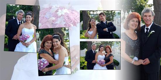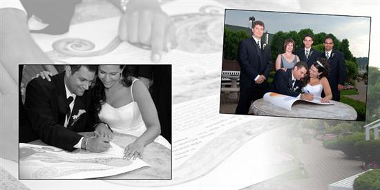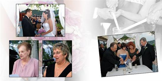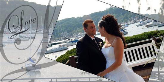
Can you girls take a look at my album and let me know if you think I should change anything? I can't look at it anymore....What a long process. Even though it's been fun, I'll be happy once I get the final product!
I think it looks great!! I know what you mean about not being able to look at it anymore. I just finished mine
jeanyus27
Posted:
Member since
Re: My Album
It looks beautiful! Did you use a site to make it or is that from your photog? I'm not really happ with what we're getting from our photog. and was thinking about creating one online.
FinallyEngaged
Posted:
Member since
Re: My Album
It came out awesome!!! I havent even started mine yet i dont even know where to begin!
Gigi08
Posted:
Member since
Re: My Album
I think it looks great! I haven't even started mine yet.
RadiantBride
Posted:
Member since
Re: My Album
It looks great. I love the quote 'Love isnt someone you can live with, it's someone you can't live without'.
bonch20
Posted:
Member since
Re: My Album
Thanks girls...I went thru so many revisions and it's so hard to go off of color copies! Appreciate you taking a look to see if we missed anything!
It's from our photographer, but I think we'll make one online too.
SFAR89
Posted:
Member since
Re: My Album
ohhh I LOVE it. The first page is amazing.
agittleman
Posted:
Member since
Re: My Album
Congrats. It looks very nice.
oldladybride
Posted:
Member since
Re: My Album
I think the pages and layouts are lovely - - wish I could have had as many pics as in your book.
I just went thru checking my pages so maybe I'm in the picky mode so I hope you don't mind a couple things that I think they could improve on. Of course this is based on what I have on my PC so on your actual proofs these things might not be an issue. but here are my first reactions to a couple things:
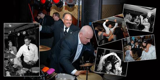
on this pic I think the white for blending pics on woman's arm is too much - - she's like 1/2 faded. (my photog had a habit of overdoing that too)
under the pic on right the white seems too bright and you can make out what the image is - - it should be faded I think but still distinguishable. To me from this draft I would think that a blob of white like that would distract from the pics.
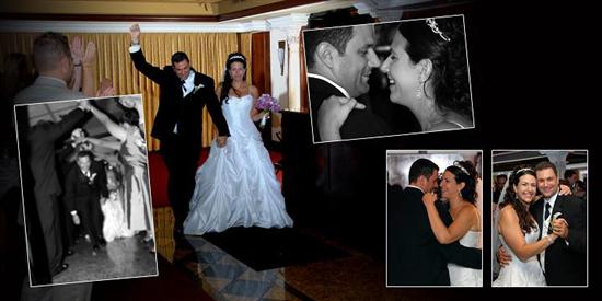
again it might just be my personal preference or being annoyed by it but again the white stripe down the center seems too pronounced. I would think the backgrounds should be extended more so they both meet in the middle with just a little blur
being very picky with this and might be the old eyes going but the extra scrolly on the L almost makes it look like S (save to me, not Love)
I think the 2 pics closest to the guys head might look better if they were swapped. the pic of the girls seems smaller and could be shifted to the right a bit so it's not so close to his head. that closeness throws the pic off to me and makes iot look crowded when it isn't.
I think the top pic on right should be shifted to the right. the black wall above his head almost looks like his head and gives it a funny shape - - atleast it does on my pc. and the larger black area to the right of the pic seems out of proportion. again, that's my opinion and just giving it to you to take a new look and see if you agree.
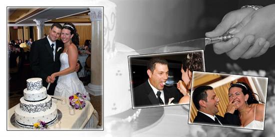
pic of you feeding DH I think might look better shifted to left a bit so other pic isn't cutting into your head so much.
well that's it. I hope you don't mind the critique but I went thru this with my own and I think at least some of the above might help.
SB7308
Posted:
Member since
Re: My Album
Love it Bonnie!!
You are way ahead of me! We havent even picked the pics we want in it yet
teenigrrl
Posted:
Member since
Re: My Album
your album looks great!!!
bonch20
Posted:
Member since
Re: My Album
Posted by oldladybride
I think the pages and layouts are lovely - - wish I could have had as many pics as in your book.
I just went thru checking my pages so maybe I'm in the picky mode so I hope you don't mind a couple things that I think they could improve on. Of course this is based on what I have on my PC so on your actual proofs these things might not be an issue. but here are my first reactions to a couple things:
well that's it. I hope you don't mind the critique but I went thru this with my own and I think at least some of the above might help.
Thanks for the comments....I think the white down the center is where the page folds, but I will take a closer look tonight. You are right on the first photo of my mom...too blended.
TrueLoveIn2008
Posted:
Member since
Re: My Album
You looked so beautiful!!!! I never saw any pics!!!!!!
Mrs. Bernabe
Posted:
Member since
Re: My Album
looks great Can't wait for mine..uugggg having to wait is painful
SparkyandAng
Posted:
Member since
Re: My Album
I absolutely love it!!! Great job. I don't remember seeing your wedding pictures before this..You looked soooo beautiful.