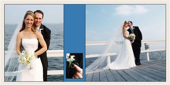
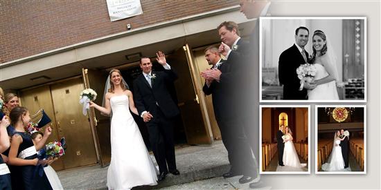
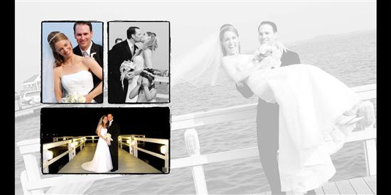
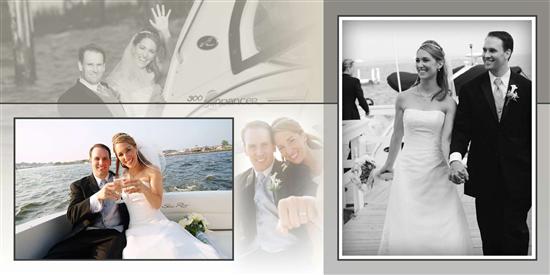
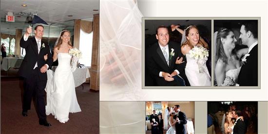
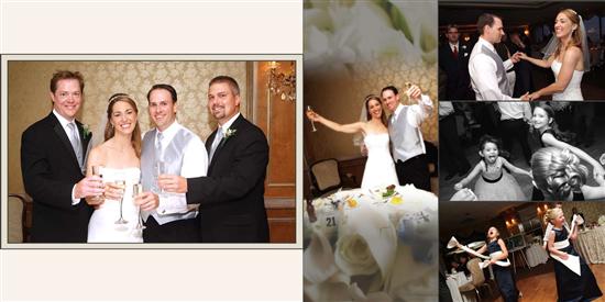
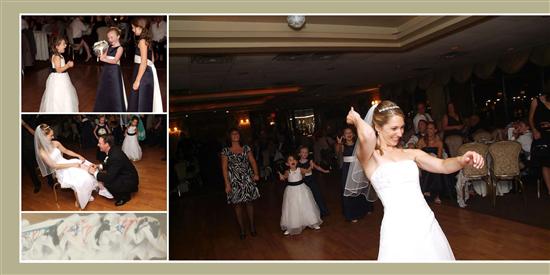
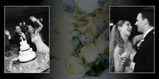
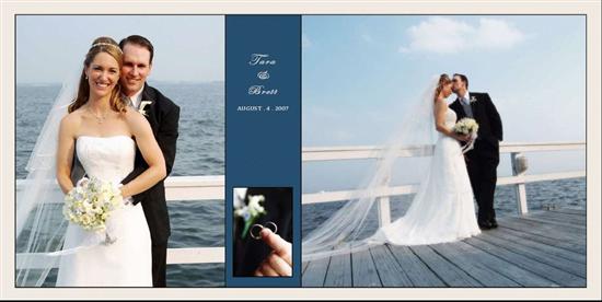
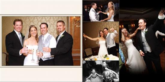
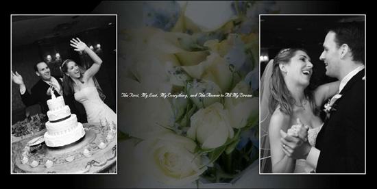
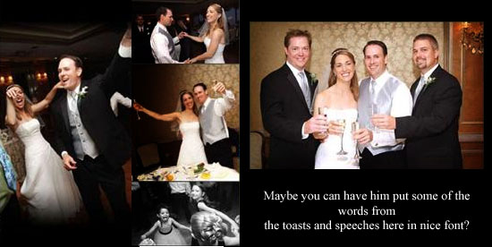
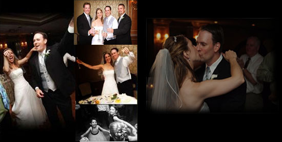
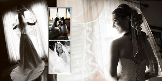
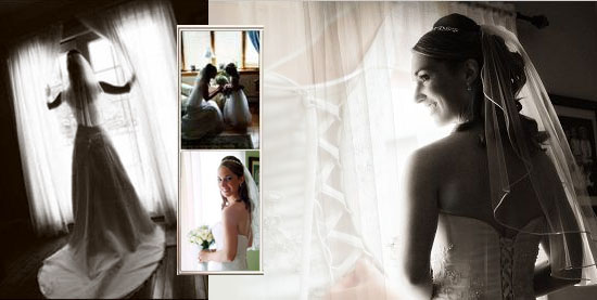
I'll post the pics in the post when I get home- just got these and couldn't wait to share! Just can't post the damn pics in the thread on this computer.
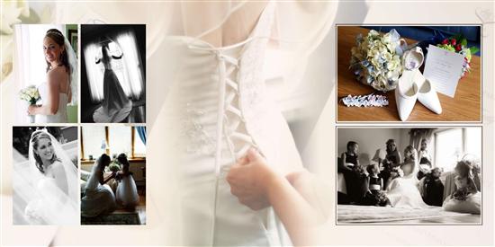
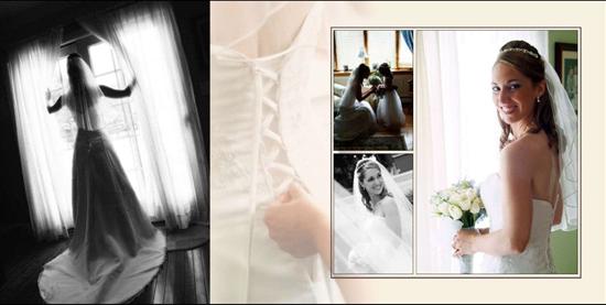
There's a few things I'd change..how about you? I feel like the bride getting ready page is too busy- those shots are just awesome and should be featured more instead of cluttered.
Opinions appreciated!
GettinHutched
Posted:
Member since
Re: My album layout is in!!! UPDATED pics are inserted for you lazy peeps :-D
Posted by HelenZ
I wanna say they suggested 60 pictures for the album in my contract...but I negotiated for more pages, so I think I added 10 more to make it 70.
I also perused the disc but only used one shot from the unedited disc.
HTH!
yes it does!! thank you! we also negotiated the # up to 70! that gives me a good idea of around how many pics per page they'd be doing. one other question- the background pics- did they pull those from some that you chose? (like zooming in) or did do the flowers/ stained glass etc. on their own by just going through the proofs? that's probably a stupid question, but I'm so clueless w/ this.
I listed the background pics and in the notes I mentioned they could be used that way. There were some he used on his own though...probably by zooming in on details in certain shots, like my bouquet. I did notice a shot that he used that I didn't even list. The stained glass I asked him to use...just wasn't expecting him to use it that way!
I was clueless too! No worries! Just look at the form online and you'll get the idea.
twinkletoes807
Posted:
Member since
Re: My album layout is in!!! UPDATED pics are inserted for you lazy peeps :-D
Gorgeous!! You both make a stunning couple and your happiness shines thru in each pic!! Congrats!
Drv0716
Posted:
Member since
Re: My album layout is in!!! UPDATED pics are inserted for you lazy peeps :-D
I love it! It really looks gorgeous!
HelenZ
Posted:
Member since
Re: My album layout is in!!! UPDATED pics are inserted for you lazy peeps :-D
Posted by GettinHutched
Posted by HelenZ
I wanna say they suggested 60 pictures for the album in my contract...but I negotiated for more pages, so I think I added 10 more to make it 70.
I also perused the disc but only used one shot from the unedited disc.
HTH!
yes it does!! thank you! we also negotiated the # up to 70! that gives me a good idea of around how many pics per page they'd be doing. one other question- the background pics- did they pull those from some that you chose? (like zooming in) or did do the flowers/ stained glass etc. on their own by just going through the proofs? that's probably a stupid question, but I'm so clueless w/ this.
I listed the background pics and in the notes I mentioned they could be used that way. There were some he used on his own though...probably by zooming in on details in certain shots, like my bouquet. I did notice a shot that he used that I didn't even list. The stained glass I asked him to use...just wasn't expecting him to use it that way!
I was clueless too! No worries! Just look at the form online and you'll get the idea.
thank you sooooooo much!!!! I didn't even look at the form yet (afraid of getting overwhelmed!! lol)......I guess that would've been helpful for me to look!! but thank you!
GettinHutched
Posted:
Member since
Re: My album layout is in!!! UPDATED pics are inserted for you lazy peeps :-D
BUMP with changes! he made the blue darker- but guess what? There was always text in there- for some reason I wasn't able to view it originally! so now the blue makes sense!
I'm liking this page better but I'm still not sure- what do you think?
This page isn't all that different- it's just added a pic that was originally on the previous page.
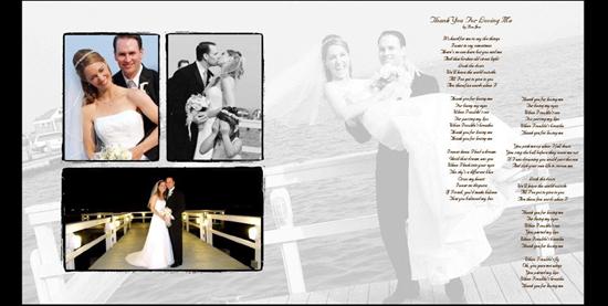
He added the lyrics to our wedding song- what do you think?
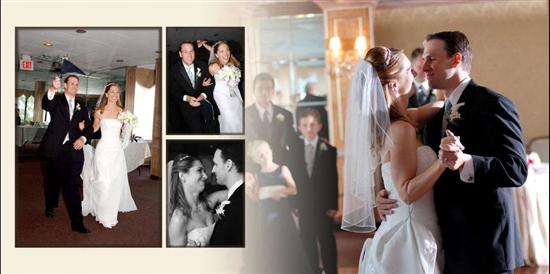
I like the first dance page much better- would you change anything?
Had the wrong pic on this page originally- he added the pic I want and now the page is pretty bad how would you fix it?
I know lots of you liked this page best- and here it is with the text- I didn't see text on it originally.
Any suggestions? Thanks ladies!
GettinHutched
Posted:
Member since
Re: My album layout is in!!! UPDATED with their CHANGES on page 2!
BUMP for those who have returned from their Turkey Day activities!!
HelenZ
Posted:
Member since
Re: My album layout is in!!! UPDATED with their CHANGES on page 2!
Ok here's my feedback...... I think the dark blue looks great especially now you can see the text.
I'm really liking the 2nd page they changed (getting ready pics), I LOVE that the b&w shot of you is bigger and more of a focus on the page. I'm thinking maybe there's a better way to transition the b&w shot and the corset shot being next to each other (perhaps they could soften the edges of the b&w shot?
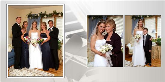
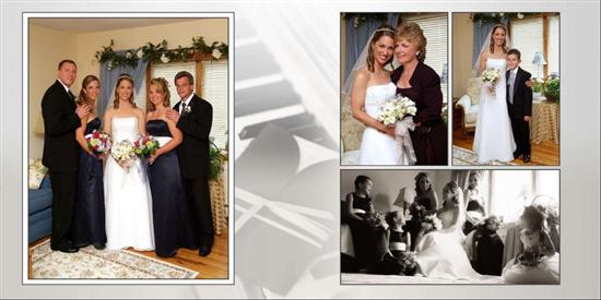
I think the getting ready/family shots page looks SO much better!! I like the BM pic w/ your family page. I absolutely LOVE the lyrics on the page they put it on!!! I think it goes perfectly w/ that shot!! I would definitely leave the first dance page alone- the changes are perfect, the page looks way less busy and you can really focus on seeing that moment.
For the page that they used the wrong pic, the other pic they used originally is really cute w/ the FG's……BUT then you'd have 2 shots of them on that page. I say, tell them to take the toasting shot of you & Brett, put in back to the way they had it originally (stretched out vertically), and have the other 3 shots on the right of that pic. I would stick w/ the one you wanted, or pick another one of you two (I like the one you chose though b/c you look like you're having fun!!, the only negative is you can't see your face as much b/c of your hand).
I think the text on the last page looks great!!! Glad to see that they edited them so quickly for you!!
GettinHutched
Posted:
Member since
Re: My album layout is in!!! UPDATED with their CHANGES on page 2!
Thanks sooo much Helen! I'm getting antsy since I'm still waiting on feedback from my sister- you know the big graphic designer one. We were supposed to look at it yesterday but of course Turkey Day was too nuts to get around to it!
I agree- the contrast between the black & white shot of me and the corset shot is just weird. He needs to soften that a bit. Do you think maybe he should just completely take out the corset shot and make the b/w shot bleed into the next page somehow? Ugh I dunno...
yeah that one page of us dancing..yikes it does not work at all. Should I remove the horizontal shot of us dancing? I'm not THAT wild about it...but it does show both of our faces, unlike the singing shot.
I had a really hard time finding great dancing shots of us...I kinda feel like they didn't do as great of a job capturing all of us dancing...maybe we were tough to capture anyway!
Thanks girl!
GettinHutched
Posted:
Member since
Re: My album layout is in!!! UPDATED with their CHANGES on page 2!
oh and I had another thought....
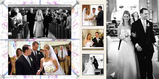
maybe I could replace the pic on the bottom right hand side with a silhouette shot...since the two are so similar. But then again, the difference in the two shots are one is the altar in the back, and one is coming from the back of the church. And I LOVE that stained glass window- I have no shots of it in my album (except as a background shot).
PeteysBride
Posted:
Member since
Re: My album layout is in!!! UPDATED with their CHANGES on page 2!
Ok here's my feedback...... I think the dark blue looks MUCH better because now you see the text and it ties it in like a little bridge.
I liove that b&W shot but its harsh I think with the corset background and then the pics on the right that are light as well. I think itsa beauiful dramatic shot, but would look better maybe if it was on a 'details' page; like that as the focus and then a close up of your bouqet/flowers, garter whatever. So that way its the focus and not competeing or overpowering other important shots of you getting ready. I agree with Helen that softening it somehow would make a bigger impact. Maybe more 'gray' than the black and white tones if that makes sense.
The getting ready/family shots page looks ALOT much better and the lyrics are awesome! Thats a great shot and easier to appreciate it now.I agree with helene that I would definitely leave the first dance page alone- the changes are perfect, the page looks way less busy and you can really focus on seeing that moment.
Um for the one of the similar church shots, I like both but I think having them right next to one another kinda detracts from both, amking them blend together if that makes sense-i think they need to either seperate them or change one of them entirely because they are both small and that close thy look oddly merged.
And I agree with this part of what helen said...'For the page that they used the wrong pic, the other pic they used originally is really cute w/ the FG's……BUT then you'd have 2 shots of them on that page. I say, tell them to take the toasting shot of you & Brett, put in back to the way they had it originally (stretched out vertically), and have the other 3 shots on the right of that pic. I would stick w/ the one you wanted, or pick another one of you two (I like the one you chose though b/c you look like you're having fun!!, the only negative is you can't see your face as much b/c of your hand).'
I think the text on the last page looks good. Overall its a much 'smoother' flowing layout now and highlights the greatest parts of your day. Hope that helps!@
UPDATE! Oops!
This page is pretty bad I think because its so empty on one side. Its looks unbalanced and lopsided because of the background. The pic of you singing is alost like coming from the lef if that makes sense. Like imagine it on the left side of the page because of where its cutting off-I think it'd look better on that side if u want to use it. then the others would have to be integrated better but that whole layouts looks weird..maybe I can fuss and then show u what I mean beter...ill bb with a visual lol..
GettinHutched
Posted:
Member since
Re: My album layout is in!!! UPDATED with their CHANGES on page 2!
Ooh thanks Jen!
I think we're gonna remove the pic on the top right of the page- the one of us holding hands and dancing- he doesn't look happy in the shot anyway- it never was a great shot.
I must say how I am with the 'fun' reception shots...I always knew they kinda stunk but now I'm really beyond annoyed. I went through EVERY shot they took and there's really nothing I like of us dancing with friends. No idea why it just didn't work out. I have some cute ones with the kids but the kids are all over the album!
PeteysBride
Posted:
Member since
Re: My album layout is in!!! UPDATED with their CHANGES on page 2!
Here try this....
Vs:
I don't think the shots are bad-I think the fact he used lighter colors on the left with so much darkness on the right made it look off.
But this is one idea..remove the borders so its all black background and maybe wordws from speeches, toatss, quotes even from guests like from your sign in that you transcribe.
OR you could also add a horizontal pic...like on the bottom thin-of your hands, or the toasting flutes...something.
GettinHutched
Posted:
Member since
Re: My album layout is in!!! UPDATED with their CHANGES on page 2!
Jen that is AWESOME! Thank you! i love that idea!
Brett's best man's toast was incredible...but i feel bad because he had two best men and we only have one of the toasts transcribed!
here's part of the toast: We thank Jon Bon Jovi and Derek Jeter They were the guys that helped him to meet her
But they were too busy to bare the rings So he settled for Matt and me, the next best things
Those guys are alright, but they don’t really know him But I think I do, so I wrote him this poem
I teach high school science, a poet I’m not But because I love him, I gave it a shot
You’ve exchanged your vows, and we’ve thrown the rice Now my friend, here’s some advice
I believe for a marriage to last to the end The thing to do is marry your best friend
Brett, your best friend Tara makes a beautiful wife Now, together you must orchestrate a wonderful life
I am positive your love will live on like a dream Well, as long as the Yankees field a team
PeteysBride
Posted:
Member since
Re: My album layout is in!!! UPDATED with their CHANGES on page 2!
Posted by GettinHutched
Jen that is AWESOME! Thank you! i love that idea!
Brett's best man's toast was incredible...but i feel bad because he had two best men and we only have one of the toasts transcribed!
here's part of the toast: We thank Jon Bon Jovi and Derek Jeter They were the guys that helped him to meet her
But they were too busy to bare the rings So he settled for Matt and me, the next best things
Those guys are alright, but they don’t really know him But I think I do, so I wrote him this poem
I teach high school science, a poet I’m not But because I love him, I gave it a shot
You’ve exchanged your vows, and we’ve thrown the rice Now my friend, here’s some advice
I believe for a marriage to last to the end The thing to do is marry your best friend
Brett, your best friend Tara makes a beautiful wife Now, together you must orchestrate a wonderful life
I am positive your love will live on like a dream Well, as long as the Yankees field a team
Oh thats an awesome toast! Yea I think the issue wasn't the pics but the actual colors used on the left-sme as for the pic of you with the corset -thinking how you could manuver that. somesimtes howing is easier than telling.
This was another option if u didn want the pic of the 4 of u so lage-a pic of you and him with the toast beneath or whatever.
GettinHutched
Posted:
Member since
Re: My album layout is in!!! UPDATED with their CHANGES on page 2!
oooh Jen that looks cool too! I'm just concerned our album is too Tara & Brett heavy. If you can imagine that. Like I said, the pics of us dancing with friends are just not album-worthy.
Which quote do you think we should use? I'm thinking maybe 'I believe for a marriage to last til the end the thing to do is to marry your best friend'
Although I think it would be fun to add the Yankee thing!
PeteysBride
Posted:
Member since
Re: My album layout is in!!! UPDATED with their CHANGES on page 2!
Posted by GettinHutched
oooh Jen that looks cool too! I'm just concerned our album is too Tara & Brett heavy. If you can imagine that. Like I said, the pics of us dancing with friends are just not album-worthy.
Which quote do you think we should use? I'm thinking maybe 'I believe for a marriage to last til the end the thing to do is to marry your best friend'
Although I think it would be fun to add the Yankee thing!
LMAO um Tara...you and brett WERE the bride and groom! It should be you too heavy lmao because in 20 years u will care more about what YOU used to look like than the friend of a cousin twice re moved I understand what U mean though-I was afraid of putting too many photos of myself in it-had more of me than of Pete and his exact words were 'Dude I want to to look at u not ur bm's. I married you.'
So dont let that stop u if u like certain things.
I like that quote. I'd probably go with something Yankee ONLY because it was suuuch a part of your planning and yet I didnt get a big sense of it in your album and I think that would personalize it a lil bit.
GettinHutched
Posted:
Member since
Re: My album layout is in!!! UPDATED with their CHANGES on page 2!
OMG Jen you have no idea what a huge help you've been! THANK YOU!!!!
This album designer is gonna hate me- my email is sooooo long right now!
PeteysBride
Posted:
Member since
Re: My album layout is in!!! UPDATED with their CHANGES on page 2!
LMAO I try!
Here try this...I hope u dont mind me taking some liberties with the pic-I chose this one because I thought the shadows in it wuld balance your other pic better of u by the window....
I used phooshop to blend the corset pic into the one of you glancing over your shoulder then moved the smaller pics to the side. Just another idea-I think if you 'scrunch' the corset pic between two others that are both dark to compliment the at the window pics shadows, it flows better.
GettinHutched
Posted:
Member since
Re: My album layout is in!!! UPDATED with their CHANGES on page 2!
oooh I had a feeling you'd think of the pic on the right- I've always loved that shot. But then I really miss the color shot of me. That looks so cool though!! You really know what you're doing- you should get a job at Duet! I've been looking at their other albums online (duetalbum.com) and I'm kinda disappointed in mine- the others seem way more creative. Maybe it's just me. Jen, you are awesome! Thank you!!
PeteysBride
Posted:
Member since
Re: My album layout is in!!! UPDATED with their CHANGES on page 2!
More than one way to skin a cat!
LOL My sis-in-law just said that to me this weekend-that I should do this on the side for extra cash for brides looking for cheaper incentives. She's a photographer I like the design aspect so going to do hers for her wedding. design them anyway and she will try to get it printed through her contacts.
Anyway, you're welcome! I enjoy it...did graphics arts in hs because went to a specialized HS but then didnt pursue it.
I think your album is ok-be a pain! Tell them layouts you like better. I know one problem as a designer is sometimes ure limited by the shots u have-like cant do certain things cause doesn't 'meld' especially iff the clients insist on certain shots. But your albu looks good. Don't feel bad!