
Member since
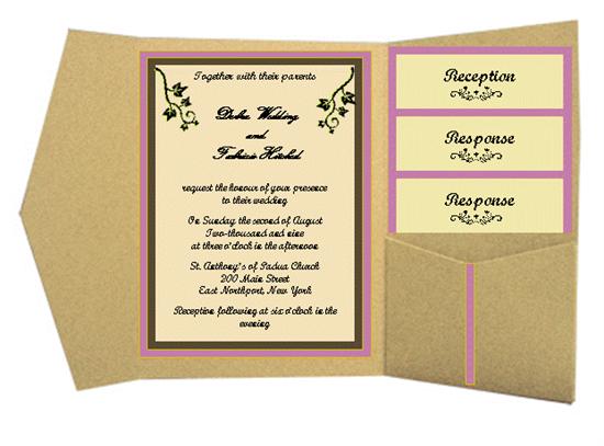
Attempt at DIY invite...
Member since
Re: Attempt at DIY invite...
Member since
Re: Attempt at DIY invite...
I love it....i wish i was this creative!!
Member since
Re: Attempt at DIY invite...
wow that came out really good!
Member since
Re: Attempt at DIY invite...
It looks great!
Member since
Re: Attempt at DIY invite...
amazing!
Member since
Re: Attempt at DIY invite...
those are really pretty. i wish i could do that
Member since
Re: Attempt at DIY invite...
Very nice!!!
Member since
Re: Attempt at DIY invite...
I would say use green as your pocketfold color, then champagne for the color of the main invite meaning the part where all the text is wriiten on then have the cardstock behind the main invite the sugarplum color and any design on the invite itself(the written part) in the green color. Also i would say all the text should be in black.
Member since
Re: Attempt at DIY invite...
BUMP
Member since
Re: Attempt at DIY invite...
Holy crap thats awesome! I would say maybe change the green to a lighter shade?
Member since
Re: Attempt at DIY invite...
Thanks. I was planning on a lighter shade of green, but where do I put it in the invitation? I can't seem to find a place for it. It is too busy looking when I add another color.
Member since
Re: Attempt at DIY invite...
very very pretty!
Member since
Re: Attempt at DIY invite...
they look great!! I second that I wish I was much more creative lol

