
Member since
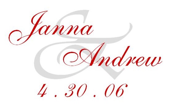
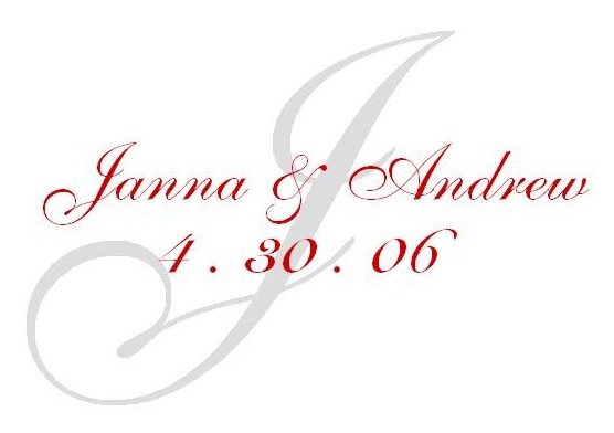
Does this look strange???

Member since
Re: Does this look strange???
I personally like the white background better.
Member since
Re: Does this look strange???
I like the white ones as well.
Member since
Re: Does this look strange???
I like the last one best. But I'd move the '.' between the numbers up. I do like the red too. It depends on how much red you're using on other things.
Member since
Re: Does this look strange???
i like the white also
Member since
Re: Does this look strange???
I like the white one
Member since
Re: Does this look strange???
Member since
Re: Does this look strange???
Member since
Re: Does this look strange???
I like them both, but think the white background one might look better when printed.
Member since
Re: Does this look strange???
My vote is for the white ones also. But that could be because I'm not a huge red fan. Both of them look really professional and will work great, whichever you choose.
Member since
Re: Does this look strange???
i like the white ones
Member since
Re: Does this look strange???
Member since
Re: Does this look strange???
i like the white background better
Member since
Re: Does this look strange???
I like the white ones!!!
Member since
Re: Does this look strange???
I like the white ones.
Member since
Re: Does this look strange???
i really love #3
Member since
Re: Does this look strange???
i like the 2nd one
Member since
Re: Does this look strange???
#3 has my vote!
Member since
Re: Does this look strange???
I like the white better. I like the red but not the initial in red on the red background, could you make that black? I think then it would look good!
Member since
Re: Does this look strange???
i like the white background better

