
Post New Topic

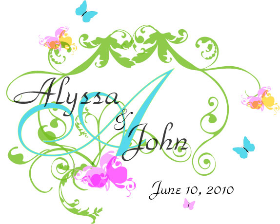
give me feedback on my monogram please!!
Alyssa79 Posted:

give me feedback on my monogram please!!
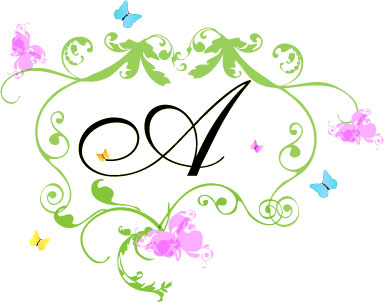
i didn't include the date on the 2nd one but you get the idea.

Please be brutally honest. I'm so used to getting critiqued with my line of work nothing phases me

my colors are like citrusy/tropical colors. Aqua is my main and the others are all accents and will definately be incorporated
FutureMrs.M Posted:

Re: give me feedback on my monogram please!!

i like the first one better but i feel i needs to be centered or something cuz it looks like the green vines on top are the center and the words need to move right a little...how did you make these

eternitybride Posted:

Re: give me feedback on my monogram please!!

I personally like the second one.

The first seems a little busy to me with the names over the initial and the various colors. The second (to me) is a cleaner look. If you want the main color of the aqua, I would change the A from black to Aqua, and see how it looks.
rocketsummer17 Posted:

Re: give me feedback on my monogram please!!

I really dont like either. The second one just doesnt seem right...The first one is really busy and doesnt seem centered. Is there a way to tone down the first one and center it more?

I am looking at number one again...Maybe change the color of your names from black to something else....I cant really figure out why it doesnt look right
MrsC2010 Posted:

Re: give me feedback on my monogram please!!

i like #1 but i agree that it needs to be centered more. I also think the A gets lost a little...would it be possible to change the color? maybe something darker?

JenBill61210 Posted:

Re: give me feedback on my monogram please!!

I like #2 better ... #1 seems like theres a lot going on

cateydee Posted:

Re: give me feedback on my monogram please!!

#2

stinenandy2010 Posted:

Re: give me feedback on my monogram please!!

First I think you did an awesome job on both!!! I think #1 better, but agree I think it needs to be better centered.

AdriandSteve Posted:

Re: give me feedback on my monogram please!!

I kind of don't like both but i like the idea.

I like having your names fully spelled out like the first and i like the butterfly on the 'A' on the second. The green all around and butterflys are ok, those purple things in the 2nd and the multi-colored ones on the 1st are a ltitle strange in my opinion
GonnaBeeMrsG Posted:

Re: give me feedback on my monogram please!!

I like the second one better!

LaurenJosh Posted:

Re: give me feedback on my monogram please!!

I agree that there's too much going on with the first one so I voted for 2

JC297 Posted:

Re: give me feedback on my monogram please!!

I like #1.

I would center your names more and I don't really like the purpley/pink chunk on the bottom. I think it would flow better if it matched the green it's next to.
grrulz Posted:

Re: give me feedback on my monogram please!!

i really like number one i love the colors greens, blues, pink and the butterflies i think those are all nice touches GREEN = LIFE lol sorry i just like green ....maybe if you can centered the names like the other girls said?
jayepyt Posted:

Re: give me feedback on my monogram please!!

i like the first and love the colors

Nichole2010 Posted:

Re: give me feedback on my monogram please!!

i think the first one is beautiful

futureMrsJSL Posted:

Re: give me feedback on my monogram please!!

Option 1 looks very busy but option 2 looks really plain. I'm not sure which way you should go. Maybe you can tweak it a little to get that happy medium.

Alyssa79 Posted:

Re: give me feedback on my monogram please!!


Posted by futureMrsJSL

Option 1 looks very busy but option 2 looks really plain. I'm not sure which way you should go. Maybe you can tweak it a little to get that happy medium.


haha my point exactly! i put the 2 up to see which direction to go in.

when i get back to work, i'll put some more up for you gals.

Christine (my *****), thank you!

and the monograms were done in Illustrator
T E R I Posted:

Re: give me feedback on my monogram please!!

I love your colors, but the first one is too busy for me, the second one has less going on which I like better

Reply to this topic

Log in to reply or quote a post.