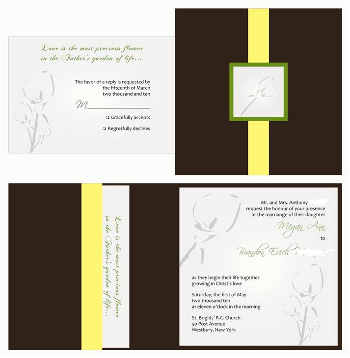
soo... this is the first draft of our wedding invitations and there are a few things that i definetly wanna change, but i was looking for your help ladies... What do you like/not like... give me all your feedback so i can pass it on to get my next draft!!!! TIA!
i like them, i just dont like on the rsvp that it looks like a bubble they fill in to accept or decline? reminds me of a scantron test lol
Future Mrs H
Posted:
Member since
Re: honest feedback please
I really like it- the colors, the font and the flower. But there is something with the response card. I cant figure out what exactly though.
Edit- Just read Jackies ans. Thats it ....the bubbles. I dont really love that- i think a line would look better
stinenandy2010
Posted:
Member since
Re: honest feedback please
i like it....but i do agree with Jackies comment, most people put a line so they can write how many guests are coming.
Jna2010
Posted:
Member since
Re: honest feedback please
i agree with Jackie about the rsvp
what about putting your monogram on the outside of the pocketfold instead of the calla lily? Just an idea, looks nice the way it is just maybe too much calla lily since its already on the invite itself
im not a big fan of that shade of green, personally i would do more of a sage but i dont know what your colors are
marinai7
Posted:
Member since
Re: honest feedback please
I agree with the bubbles. Also maybe you can add a line to show how many are attending. Otherwise, it's pretty.
soontobecruz
Posted:
Member since
Re: honest feedback please
I agree with the other girls about the bubbles. And I agree with Joanna about the lily on the front. A monogram would look really nice.
Pretty!
meganbrandon
Posted:
Member since
Re: honest feedback please
Posted by CloudNine
i like them, i just dont like on the rsvp that it looks like a bubble they fill in to accept or decline? reminds me of a scantron test lol
i'll definetly have her change that! Thanks, i didnt even realize that
meganbrandon
Posted:
Member since
Re: honest feedback please
Posted by Jna2010
i agree with Jackie about the rsvp
what about putting your monogram on the outside of the pocketfold instead of the calla lily? Just an idea, looks nice the way it is just maybe too much calla lily since its already on the invite itself
im not a big fan of that shade of green, personally i would do more of a sage but i dont know what your colors are
in her email back to me, she said it would be monogrammed & calla lilly's on the emblem... you think that is too much? i thought it might be cool since the calla is so simple?
halfbaked
Posted:
Member since
Re: honest feedback please
Posted by Jna2010
i agree with Jackie about the rsvp
what about putting your monogram on the outside of the pocketfold instead of the calla lily? Just an idea, looks nice the way it is just maybe too much calla lily since its already on the invite itself
im not a big fan of that shade of green, personally i would do more of a sage but i dont know what your colors are
ITA about the calla lily, but I may be biased. I'm not a big fan of them so it might just be overload for me (whereas my invites are damask overload lol.).
It also seems a little strange to me that the writing is so off kilter. It's the the sentence is continuing on but it's completely on the other side of the page. Just a thought!
Jna2010
Posted:
Member since
Re: honest feedback please
Posted by meganbrandon
Posted by Jna2010
i agree with Jackie about the rsvp
what about putting your monogram on the outside of the pocketfold instead of the calla lily? Just an idea, looks nice the way it is just maybe too much calla lily since its already on the invite itself
im not a big fan of that shade of green, personally i would do more of a sage but i dont know what your colors are
in her email back to me, she said it would be monogrammed & calla lilly's on the emblem... you think that is too much? i thought it might be cool since the calla is so simple?
personally i think i would just do my monogram on the front, but if you have the calla lilly as the background and your monogram over it i think that'd be nice too
mag2010
Posted:
Member since
Re: honest feedback please
Posted by M_Berk-Glenn
I love them they way they are
I agree! Very pretty!
01ELLIE
Posted:
Member since
Re: honest feedback please
i like the colors and the lillies!!
20mrsc10
Posted:
Member since
Re: honest feedback please
ok here's the ocd..i think that personally i would change the font at the top of the rsvp cards, to match the font that your names are in..i believe it's scriptina? i feel like it may be a bit more unified then..
AngnShaun
Posted:
Member since
Re: honest feedback please
I love the colors... if they were mine i would put some color in the lillys... make them more defined...
meganbrandon
Posted:
Member since
Re: honest feedback please
Posted by AngnShaun
I love the colors... if they were mine i would put some color in the lillys... make them more defined...
yeah, i was kinda thinking that too! We're doing green as the BM color & green/yellow/ivory flowers... any recommendations for colors in the callas?
grrulz
Posted:
Member since
Re: honest feedback please
I have to agree with Jackie have them put a line instead of a bubble! I really like the color of the invite
DaniandKen2010
Posted:
Member since
Re: honest feedback please
I don't like the bubbles and I would put a monogram instead of the calalily
AngnShaun
Posted:
Member since
Re: honest feedback please
Posted by meganbrandon
Posted by AngnShaun
I love the colors... if they were mine i would put some color in the lillys... make them more defined...
yeah, i was kinda thinking that too! We're doing green as the BM color & green/yellow/ivory flowers... any recommendations for colors in the callas?
i would use the brown and green... just small lines outlining the shape... but ask the lady what she would use...