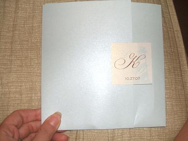
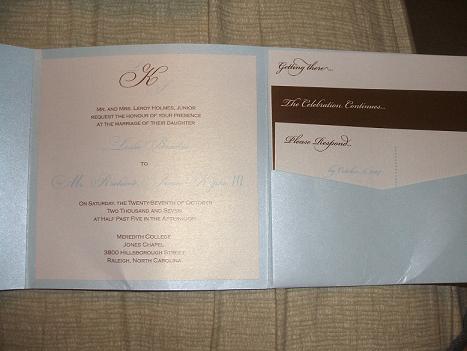
ok why im doing this now and didn't do it earlier i don't know lol. Ok i received one of the samples i ordered today, and it was one i was really waiting for. Ok the front part i was kind of like EH about, i think its the sticker on the front, if it was a different design maybe it'd be better. The inside i love and love the colors and goes with my color scheme. But i just can't help saying eh about the front part.
Sorry not the greatest pictures...the quality of cardstock is good and its nice and shimmery, and the bottom got bent but only bc mailman folded the envelope it was in and stuck it in my mail box
first pics are of the front
then the inside
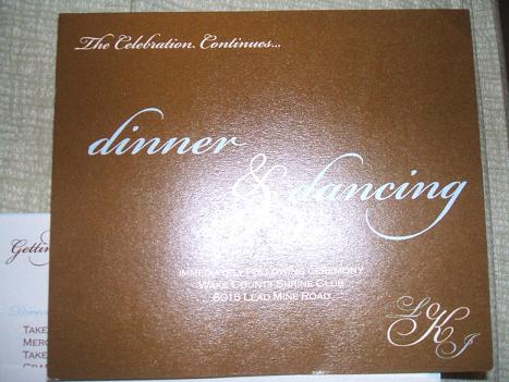
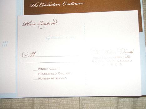
then a pic of the brown insert, and i love that in big letters it says dinner and dancing...then last pic of RSVP card
I am calling another company and asking them to send my other sample ASAP, its the other one i really loved but i made a mistake when mailing it GRRRR
2007 Crescent Bride
Posted:
Member since
Re: Honest opinions please RE: invitation
I like the invitation but don't love it. I feel like your names don't stand out on the invite and maybe the label on the front should be brown. I love the color combination and I like the inserts.
LeslieMike
Posted:
Member since
Re: Honest opinions please RE: invitation
Love it! Maybe if you have a brown layer behind the actual invitation it will pop a little more, since its cream on blue. I would have to see it in person though. Just a little touch.
GinaZ
Posted:
Member since
Re: Honest opinions please RE: invitation
I like it- but if its not what you really want, and you have enough time, keep looking. But if you do use this, I think people will like it because it is very nice!!
cmjd
Posted:
Member since
Re: Honest opinions please RE: invitation
I really like it. I think the sticker looks better on a brown background though too.
Kimbalina
Posted:
Member since
Re: Honest opinions please RE: invitation
Just saw other pics with the brown sticker, and I like that one better
Snick n Nick
Posted:
Member since
Re: Honest opinions please RE: invitation
Posted by Espo22
Posted by bemyyoko
i really like it.
thank you...i dont know why the front bothers me haha, but lately i am horrible at making decisions. Maybe if the sticker on the front was brown fh will see it tomorrow so i'll see what he says
I think you're right, the sticker seems to blend in too much....maybe if it was brown it would be better, like you say....
MrsK2008
Posted:
Member since
Re: Honest opinions please RE: invitation
I honestlylike it, right down to the font
del Rio
Posted:
Member since
Re: Honest opinions please RE: invitation
I like it and the changes you wanna make sound perfect! I love the Dinner and Dancing reception card!
sassygirl9
Posted:
Member since
Re: Honest opinions please RE: invitation
Yea I agree with youEspo. The inside is gorgeous...but the outside is 'blah' as you said. It does look plain to me. maybe a ribbon and a tag...look at other invites and see how they seal them. I like the ribbon and rhinestone buckle, we almost did that but decided on a bow instead.
AR31
Posted:
Member since
Re: Honest opinions please RE: invitation
the brown sticker one is lovely!! maybe spice up the font a bit.. but i love the color combo and the whole look of it!!
Mizzdimple
Posted:
Member since
Re: Honest opinions please RE: invitation
i know what you mean about the front if you want the wow factor....then no...look for another one..but its okay., maybe even Cute not wow.
minibride08
Posted:
Member since
Re: Honest opinions please RE: invitation
I agree... I like the brown sticker....
Also, you mentioned it got bent in your mailbox... Most invites this size (large/ square) have bent in my mailbox when being delivered to me. If you have a lot going to smaller mailboxes in apts. / condos/ etc. ... just something to keep in mind....
The invite is very pretty & I do love the script/ inserts too...
Love08
Posted:
Member since
Re: Honest opinions please RE: invitation
I like them!
dancinmyazoff
Posted:
Member since
Re: Honest opinions please RE: invitation
I voted 'it's ok'....and I think that's what you think about them too...you want to be 100% happy with them so I would keep looking if you're not too sure about the front. I do love the reception card with the 'dinner and dancing' as well and the shimmery cardstock looks pretty but I think you can find ones you like better
binx214
Posted:
Member since
Re: Honest opinions please RE: invitation
I had the same feeling when i got my sample of a pocketfold so i decided to go with a ribbon instead but the sticker would look better if you did the ribbon and the sticker it looks more finished in my opinion
futuremrsfab
Posted:
Member since
Re: Honest opinions please RE: invitation
very nice! Can you change the sticker- maybe a belly band in the chocolate color?
Espo22
Posted:
Member since
Re: Honest opinions please RE: invitation
Posted by Katie&Chris2006
It's nice but I think it is missing that extra something special - I agree with maybe doing something different with the front tag (like maybe add a second backing layer to it of the brown color?)
YES!!! its like i feel its nice but there is something that is missing.
Espo22
Posted:
Member since
Re: Honest opinions please RE: invitation
Posted by mRm2008
Denise, Hope you don't mind. I played around a bit in photoshop for comparison's sake. Just to give you and idea about a different color combo on front. I think they look really good as is!
oh wow thank you so very much, of course i dont mind this was very nice of you to do. See i definitely like the way it looks better in your first pic, the brown with the champagne on the inside makes a huge difference
thank you again
ChristineAaron08
Posted:
Member since
Re: Honest opinions please RE: invitation
I like it, but I liked the last ones you posted better. But it has to be what you like best- thats what matters.
emomma17
Posted:
Member since
Re: Honest opinions please RE: invitation
I like them I think they are very pretty and elegant. It matters if you are happy with them, the color combination is gorgeous together.