Post New Topic

Invitation Font Poll!

CubanBride Posted:

Invitation Font Poll!

september2004 Posted:

Re: Invitation Font Poll!

this i think is a preference call you will have to make...

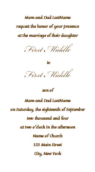
the only thing you may want to keep in mind is overall legibility. i used a combo of 2 fonts - one for the majority of text, and a fancier one for our names, attached is an example.

of the ones you listed, i am stuck between 2 and 3!
MrsK-in-June05 Posted:

Re: Invitation Font Poll!

I voted for #3 b/c I think it is formal and legible. I did not like #1 or #4 because they were harder to read. Hope this helped.

dukey Posted:

Re: Invitation Font Poll!

I like number 2 and 3 the best.

lorsin Posted:

Re: Invitation Font Poll!

3 and 5 are the easiest to read.

I think it also depends on the style of your invite - do you have a picture?

I know I went with a more gothic font (Black Chancery) because of our Halloween theme and the invitations have an old-world feel to them.
alexlynn7 Posted:

Re: Invitation Font Poll!

i really like #2, because it's different from the traditional (#3) but still very elegant and legible. very nice 'y'! i also really like #4 - it's very pretty and festive, but it's a little less easily legible.

Reply to this topic

Log in to reply or quote a post.