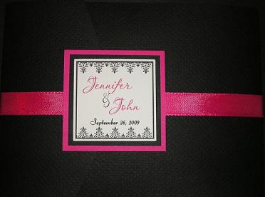
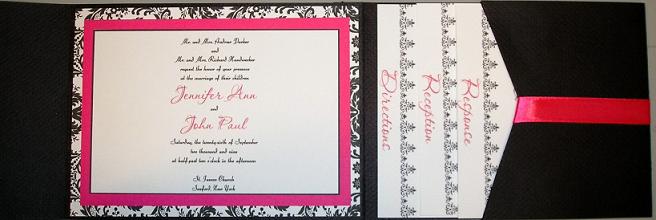
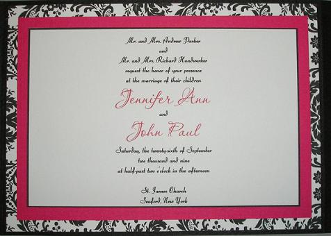
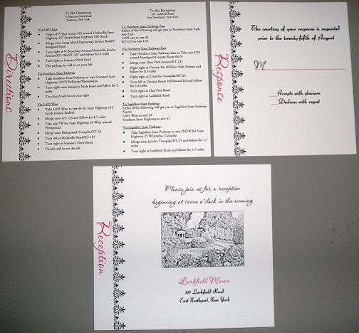
I need some opinions.... my first reaction is i am in love except still not 100% sure about the font on the invite part itself. Looks a bit small and hard to read?
**Question below with pic
FuTuRe MrS MaZz
Posted:
Member since
Re: INVITE PROOFS!!!! ** Update with Question**
Font needs to be spread further out to make it more easy to read andddd to reduce the amt of white space on either side... JMO
twoifbysea
Posted:
Member since
Re: INVITE PROOFS!!!! ** Update with Question**
they're super pretty! I agree, the second proof is much easier to read.
Im a Pepper
Posted:
Member since
Re: INVITE PROOFS!!!! ** Update with Question**
Posted by gporka23
Ok do you think I should stick with the original font that I had on my prelim design? Originally I wanted cursive but the more I look at this the more I like it better than the cursive
I definitely like the font from the preliminary design!
FuTuRe MrS MaZz
Posted:
Member since
Re: INVITE PROOFS!!!! ** Update with Question**
Posted by gporka23
Ok do you think I should stick with the original font that I had on my prelim design? Originally I wanted cursive but the more I look at this the more I like it better than the cursive
def like the 2nd one better
Brat23
Posted:
Member since
Re: INVITE PROOFS!!!! ** Update with Question**
OMG so pretty!
FutureMrsG
Posted:
Member since
Re: INVITE PROOFS!!!! ** Update with Question**
I love them- I would not change a thing.
Jennmolloy
Posted:
Member since
Re: INVITE PROOFS!!!! ** Update with Question**
I like the Original one (2nd on here). I like the block letters it makes it easier to read.
JennyAPH
Posted:
Member since
Re: INVITE PROOFS!!!! ** Update with Question**
Thanks so much for all your opinions ladies!! I am having her switch it back to the original font...