
Member since
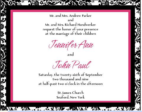
INVITE PROOFS!!!! ** Update with Question**
Member since
Re: INVITE PROOFS!!!!
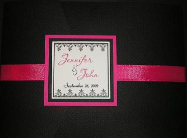
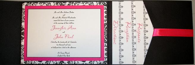
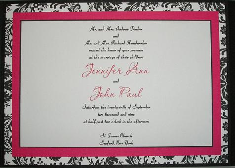
i LOVE the color combo.. but i do agree about it being hard to read. not sure how it would look in person, but i think it looks great. maybe that minor adjustment to the font or font size.
Member since
Re: INVITE PROOFS!!!!
Member since
Re: INVITE PROOFS!!!!
Member since
Re: INVITE PROOFS!!!!
They are beautiful!!!!!!
Member since
Re: INVITE PROOFS!!!!
i think they're beautiful!
Member since
Re: INVITE PROOFS!!!!
Love them! I do agree about the font though, its a little hard to read.
Member since
Re: INVITE PROOFS!!!!
Member since
Re: INVITE PROOFS!!!!
Member since
Re: INVITE PROOFS!!!!
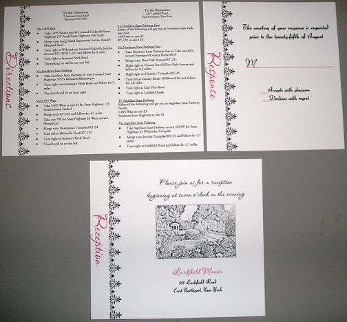
I love the colors, and it's very different to have the cards have the text going down the side...but I have to agree with the other girls, the script is a little hard to read.
Member since
Re: INVITE PROOFS!!!!
Its a little hard to read, but it might be better in person. Pretty though.
Member since
Re: INVITE PROOFS!!!! ** Update with Question**
Ok do you think I should stick with the original font that I had on my prelim design? Originally I wanted cursive but the more I look at this the more I like it better than the cursive
Member since
Re: INVITE PROOFS!!!! ** Update with Question**
Love the colors - but you are right about the font/size - it needs to be bigger or another font - or people will strain to read it...
Member since
Re: INVITE PROOFS!!!! ** Update with Question**
Member since
Re: INVITE PROOFS!!!! ** Update with Question**
Member since
Re: INVITE PROOFS!!!! ** Update with Question**
Member since
Re: INVITE PROOFS!!!! ** Update with Question**
I love it, I do think if you go with the original font it would be easier to read. I ended up changing my font too bc it seemed like it would be a pain to read.
Member since
Re: INVITE PROOFS!!!! ** Update with Question**
I had to change the font on mine for the same reason.. Because of the size of the invite the font I wanted (Which was cursive ) was hard to read... If i wanted to keep that font I had to go with a 5x7invite... I ended up with a non-cursive font in the same invite size and it actually looks great that way.
Member since
Re: INVITE PROOFS!!!! ** Update with Question**
Member since
Re: INVITE PROOFS!!!! ** Update with Question**
very pretty! I do agree i'm not a big fan of the font.

