Post New Topic

Invites- UPDATED W PICS

Original post by GiannisWifey
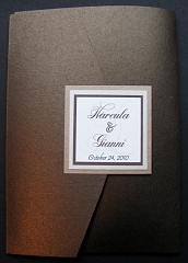
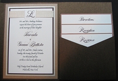
I don't think I even know what I want.....

Got an email from 'her' saying my new proofs were on her website under HaroulaA.....

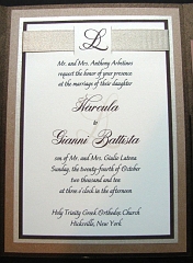
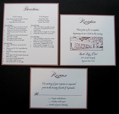
can you girls look at tell me what you think?

Font, pocketfold color, ribbons, layering, etc.......

somethinggggggg is missing and I don't know what?


THIS IS THE FIRST ONE
8023452_1.jpg 8023452_2.jpg 8023452_3.jpg 8023452_4.jpg
Iluvpoodles Posted:

Re: Invites- UPDATED W PICS

The first one is like my invite, except different layout. I have the ribbon on the top like that too. I think it looks pretty. Not too busy and classy looking. Only thing is, I'm beginning to agree with people that alot her work looks the same
soontobecruz Posted:

Re: Invites- UPDATED W PICS

I personally like #2 better. It think something about them stands out a little more.

They are both stunning though. My personal taste is if I got #2, I would think.. wow this is going to be some wedding. Very classy
GiannisWifey Posted:

Re: Invites- UPDATED W PICS


Posted by soontobecruz

I personally like #2 better. It think something about them stands out a little more.

They are both stunning though. My personal taste is if I got #2, I would think.. wow this is going to be some wedding. Very classy


Do you think maybe a different ribbon would make it stand more? maybe like a different color or something not as THICK as that dark brown??
MrsHazel2B Posted:

Re: Invites- UPDATED W PICS

I love #1, but ITA agree with maybe a little bling for a pop. That's what you're looking for, a pop!

MrsDR2010 Posted:

Re: Invites- UPDATED W PICS

#1

GiannisWifey Posted:

Re: Invites- UPDATED W PICS

where do i put the blingggggg??

Rosalind_75 Posted:

Re: Invites- UPDATED W PICS


Posted by GiannisWifey

where do i put the blingggggg??


that sounds like a job for alyssa.
she figured out mine in 2secs
StaceyWill Posted:

Re: Invites- UPDATED W PICS


Posted by GiannisWifey


Posted by soontobecruz

I personally like #2 better. It think something about them stands out a little more.

They are both stunning though. My personal taste is if I got #2, I would think.. wow this is going to be some wedding. Very classy


Do you think maybe a different ribbon would make it stand more? maybe like a different color or something not as THICK as that dark brown??


Maybe if you put the lighter ribbon from #1 on #2.
MrsHazel2B Posted:

Re: Invites- UPDATED W PICS


Posted by GiannisWifey

where do i put the blingggggg??


I say a different color ribbon for #2. If you go with #1, I'd add bling to the monogram maybe.
Lsorrent Posted:

Re: Invites- UPDATED W PICS

I'm looking at it again........what if you did the first one, but with the pocketfold in the white color of the second one???? Instead of the dark brown???

And maybe you could put a small crystal in the top left corner and bottom right corner of the monogram tab???
MarjorieFrank Posted:

Re: Invites- UPDATED W PICS

I like the first one a lot more

RGEC47 Posted:

Re: Invites- UPDATED W PICS

They are both beautiful. I like the 2nd one better,. It seems more elegant, IMO.

Alyssa79 Posted:

Re: Invites- UPDATED W PICS

i like the design of the 1st one but the shape of the 2nd. i love squares!!

i'm working on finding where to put the bling just have to sneak opening the files and everything lol
Summertimegal424 Posted:

Re: Invites- UPDATED W PICS

i looooveee # 2!!!!

GiannisWifey Posted:

Re: Invites- UPDATED W PICS


Posted by Alyssa79

i like the design of the 1st one but the shape of the 2nd. i love squares!!

i'm working on finding where to put the bling just have to sneak opening the files and everything lol


THANK YOUUUUUUUUUUU!
Noelsgirl Posted:

Re: Invites- UPDATED W PICS

I like the 2nd one better. It pops more!

cleokizzy Posted:

Re: Invites- UPDATED W PICS


Posted by GiannisWifey


Posted by soontobecruz

I personally like #2 better. It think something about them stands out a little more.

They are both stunning though. My personal taste is if I got #2, I would think.. wow this is going to be some wedding. Very classy


Do you think maybe a different ribbon would make it stand more? maybe like a different color or something not as THICK as that dark brown??


i love the 2nd one because of the color. imo, it sticked out because of the white/cream main colors. the 1 was too dark that it doesnt really catches my eye.

i love the 2nd as it is....
jayepyt Posted:

Re: Invites- UPDATED W PICS

i pick 2

Reply to this topic

Log in to reply or quote a post.