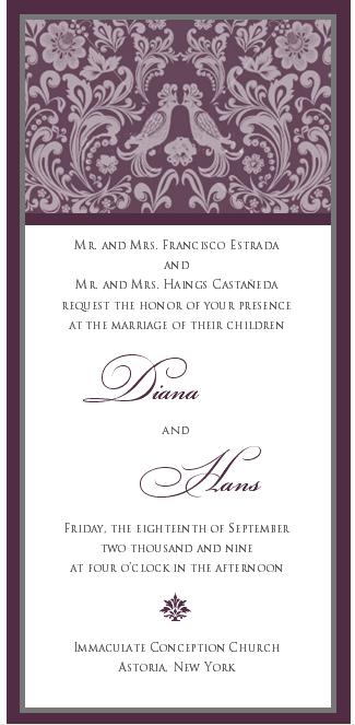
Hello All! I received a mock-up of an invitation from a very popular vendor. I want to get your impressions on it. I asked for something different, formal, traditional and contemporary all at once. Oh and also, to incorporate our love birds theme.
I have some edits to this- I'd like to change the font of our names and have another color incorporated. Also, there will be a thin ribbon with a rhinestone buckle across the top.
Please give me your thoughts! TIA
ETA: There will be 3 layers- represented by the different colored edges.
i think the love birds were incorperated very well!!
also, be careful adding a 3rd font, 3 fonts sometimes makes it look too busy.
love it
MrsGRod09
Posted:
Member since
Re: Feedback on my invite
It's very beautiful and truly brought your vision to life. I love the floral and love bird motif .
Im a Pepper
Posted:
Member since
Re: Feedback on my invite
I love it!
Novbride09
Posted:
Member since
Re: Feedback on my invite
Nice!
evewedsjc
Posted:
Member since
Re: Feedback on my invite
I ACTUALLY ADORE THE TOP DESIGN VERY ORIGINAL.. I WOULD HAVE HER WORK ON THE PLACEMENT OF YOUR NAMES...TOO MUCH BLANK SPACE WITH THEM STAGGERED THAT WAY...MAYBE WITH A DIFFERENT FONT.
BUT BASICALLY IT'S BEAUTIFUL
BarbieGrl10
Posted:
Member since
Re: MY INVITE- your comments please
I REALLY like it!!!!!!!!!!!!!!!
ddnsp618
Posted:
Member since
Re: MY INVITE- your comments please
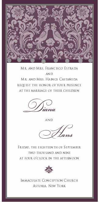
I think the ribbon would look good, where i photoshopped the grey dots in. i would be so pretty....otherwise i love fonts!
ddnsp618
Posted:
Member since
Re: MY INVITE- your comments please
Posted by ddnsp618
I think the ribbon would look good, where i photoshopped the grey dots in. i would be so pretty....otherwise i love fonts!
What are the grey dots....do they represent rhinestones? So creative!
meara
Posted:
Member since
Re: MY INVITE- your comments please
I like it. a lot .. my two suggestions would be
1. could you make the little design that is at the bottom of the invitation the same flower that is under the two love birds? I think that would give it more cohesion.
2. I think that the top is busy but I like it. I would say that I think adding the ribbon and rhinestone might be too much with that pattern so if you are attached to the ribbon/rhinestone idea I would make the pattern less busy, or think about not doing ribbon. . (of course BIG disclaimer - this is only my opinion w/o seeing it)
coldasice217
Posted:
Member since
Re: MY INVITE- your comments please
I like it a lot...I would lose the rhinestones only and just use the ribbon as a border. Other than that, it's beautiful!
littlepixie12
Posted:
Member since
Re: MY INVITE- your comments please
its very pretty.. i think it captured your request of formal, traditional and contemporary
MEL0880
Posted:
Member since
Re: MY INVITE- your comments please
very pretty.. and elegant
FuTuRe MrS MaZz
Posted:
Member since
Re: MY INVITE- your comments please
looks great! .... but if i were to comment on anything, it would be to make make the picture/border on top not as wide