Post New Topic

My Reherseal Dinner Invite Pics (take II)!

BethanyLynn Posted:

Re: Reherseal Dinner Invites (take II)!

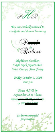
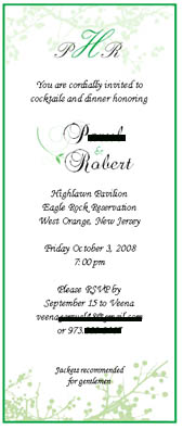
I like the green design...maybe with black writing?

dedecakes Posted:

Re: Reherseal Dinner Invites (take II)!

Yea, I still like the green one.

pa56 Posted:

Re: Reherseal Dinner Invites (take II)!

Thanks!
KimberlyScott Posted:

Re: Reherseal Dinner Invites (take II)!


Posted by BethanyLynn

I like the green design...maybe with black writing?


I second that.
RGV07 Posted:

Re: Reherseal Dinner Invites (take II)!

i like the green onetoo, maybe try to do it with black fonts for us to judge

pa56 Posted:

Re: Reherseal Dinner Invites (take II)!


Posted by RGV07

i like the green onetoo, maybe try to do it with black fonts for us to judge

Camroy Posted:

Re: My Reherseal Dinner Invite Pics (take II)!

I prefer the Green one with green fonts.

Summertimegal424 Posted:

Re: My Reherseal Dinner Invite Pics (take II)!

love the green one!

ttdiff11 Posted:

Re: My Reherseal Dinner Invite Pics (take II)!

i love the one with the green!

KellymKuehn Posted:

Re: My Reherseal Dinner Invite Pics (take II)!

Green one!

Goldie39 Posted:

Re: My Reherseal Dinner Invite Pics (take II)!

green

pa56 Posted:

Re: My Reherseal Dinner Invite Pics (take II)!

Thanks everyone... looks like it's unanimous!

ckleinismine Posted:

Re: My Reherseal Dinner Invite Pics (take II)!

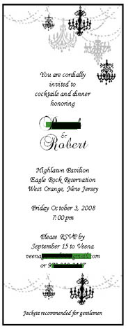
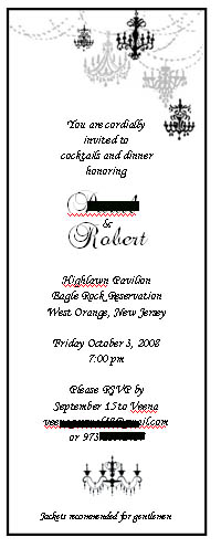
The black one by far is gorgeous!

pa56 Posted:

Re: My Reherseal Dinner Invite Pics (take II)!


Posted by ckleinismine

The black one by far is gorgeous!


I like the black one because it's elegant and dare I say.. a litle 'stuffy.' I want my family to know it's an elegant dinner party so they'd be tempted to leave their screaming kids at home.

The green one is nice and my FH is Irish but it's more fun. Dilemma, dilemma!
Soon2BMrsW Posted:

Re: My Reherseal Dinner Invite Pics (take II)!

i like the black one

yswedding Posted:

Re: My Reherseal Dinner Invite Pics (take II)!

I like this one the most, it just looks so elegant and classic to me.

Snick n Nick Posted:

Re: My Reherseal Dinner Invite Pics (take II)!

I actually like the black one on top, but I would take out the chandeliers on the bottom--I think just having them on the top looks beautiful and elegant, but once they're on the bottom too it's a little too matchy matchy. HTH!

pa56 Posted:

Re: My Reherseal Dinner Invite Pics (take II)!


Posted by Snick n Nick

I actually like the black one on top, but I would take out the chandeliers on the bottom--I think just having them on the top looks beautiful and elegant, but once they're on the bottom too it's a little too matchy matchy. HTH!


Good idea. Any suggestions on how I can fill the space? A monogram? Or just leave the space empty?
kayemmbee Posted:

Re: My Reherseal Dinner Invite Pics (take II)!

I like the black one too, but I agree about losing the extra stuff on the bottom.

Reply to this topic

Log in to reply or quote a post.