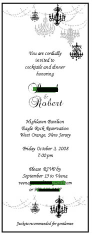
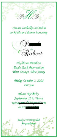
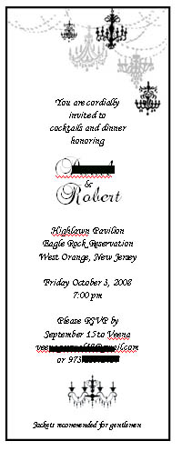
Which ones do you like better? I made them myself so can change color, font and design. Please advise!!
CloudNine
Posted:
Member since
Re: My Reherseal Dinner Invite Pics (take II)!
green
Camroy
Posted:
Member since
Re: My Reherseal Dinner Invite Pics (take II)!
Posted by pa56
Posted by Snick n Nick
I actually like the black one on top, but I would take out the chandeliers on the bottom--I think just having them on the top looks beautiful and elegant, but once they're on the bottom too it's a little too matchy matchy. HTH!
Good idea. Any suggestions on how I can fill the space? A monogram? Or just leave the space empty?
What about incorporating your avatar or a similar pic?
pa56
Posted:
Member since
Re: My Reherseal Dinner Invite Pics (take II)!
Posted by Camroy
What about incorporating your avatar or a similar pic?
I could... but that is already on my wedding invitation and my program.
I am going to do the black one. I bought black and white cardstock. I will print it on white and then paste it onto a black matte so it has two layers. I'll post pics when it's done!!
The green one didn't look that great on my printer. i looked like a moldy green and ruined the look.