
Member since
My Tessa Mockup
Member since
Re: My Tessa Mockup
i like it!
Member since
Re: My Tessa Mockup
Member since
Re: My Tessa Mockup
Member since
Re: My Tessa Mockup
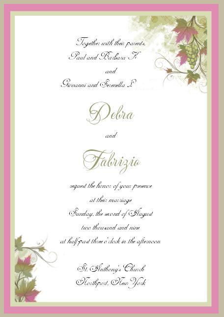
I think it should be a lil bit darker, I agree. It needs something to make it pop I am just not sure exactly what that something is... Otherwise I like the graphics on it...
Member since
Re: My Tessa Mockup
I agree your names should stand out more, but other than that, I think it looks great!!!!!!
Member since
Re: My Tessa Mockup
Member since
Re: My Tessa Mockup
I love the grapes...I'm very italian like that lol. I think your names should be a dark green, and I would ask to see another font...the script of the font seems to slant up, or maybe its just my eyes. But overall it's very pretty, I think it just needs a font tweek.
Member since
Re: My Tessa Mockup
Its very nice, but I think the names would look better in the pink that's on the border. jmo
Member since
Re: My Tessa Mockup
like the design but i agree with the names... maybe try that darker purple thats in the leaf design in the corner?
Member since
Re: My Tessa Mockup
i like the design but the font seems a lil small and squishy....mabe something a lil more clear, easier to read....and i agree with the font color of the names...should be sometihng a lil more eye catching
Member since
Re: My Tessa Mockup
I like the design especially the grapes, but I feel something else should be added, for instance on the upper right hand corner.
Member since
Re: My Tessa Mockup
looks nice.
Member since

