
Member since
My Tessa Preliminary design! with PICS!
Member since
Re: My Tessa Preliminary design! with PICS!
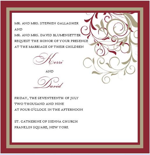
It's gorgeous but there's that big empty space in the bottom right - is there something that could be put there to balance it out? Maybe like a ribbon corner?
Member since
Re: My Tessa Preliminary design! with PICS!
yeah I agree, I actually said i was thinking of having the design vertical to avoid that look! thanks!
Member since
Re: My Tessa Preliminary design! with PICS!
Very very pretty! I agree, perhaps make the design vertical all the way down, or center justify the text and have the design at opposite corners perhaps? Other than that I love it! Great color scheme!
Member since
Re: My Tessa Preliminary design! with PICS!
Just a suggestion... if you love it, sign the contract now... prices change....
Member since
Re: My Tessa Preliminary design! with PICS!
very pretty!! love the colors!!
Member since
Re: My Tessa Preliminary design! with PICS!
thanks girls.. I didn't get a price yet... is that bad? How did they change? a lot?
Member since
Re: My Tessa Preliminary design! with PICS!
Member since
Re: My Tessa Preliminary design! with PICS!
Member since
Re: My Tessa Preliminary design! with PICS!
Member since
Re: My Tessa Preliminary design! with PICS!
very pretty!
Member since
Re: My Tessa Preliminary design! with PICS!
Very pretty, I agree with others about doing the design vertically.
Member since
Re: My Tessa Preliminary design! with PICS!
I like it alot I wouldnt change the design but I would space down the writing and move the place you are having it to the right
Member since
Re: My Tessa Preliminary design! with PICS!
or I was just looking at it leave that design just have her add it again under it
Member since
Re: My Tessa Preliminary design! with PICS!
Very pretty I love the colors
Member since
Re: My Tessa Preliminary design! with PICS!
Member since
Re: My Tessa Preliminary design! with PICS!
Member since
Re: My Tessa Preliminary design! with PICS!
someone have the link to her website?
Member since
Re: My Tessa Preliminary design! with PICS!
love it!! Just speak to her and she will make it happen for you!! Let us see the final...
Member since

