Post New Topic

need FEEDBACK from you ladies on invite design
JessicaM. Posted:

need FEEDBACK from you ladies on invite design
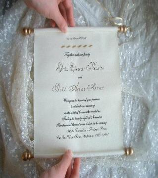
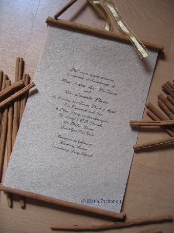
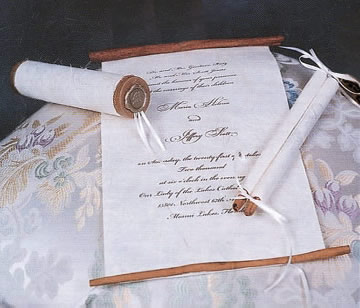
I am really hoping to get feedback of all kinds here. these are the first pics of my invites. the design and pics I gave my friend were followed to a tee, but I feel like they need something more, I just don't know what.

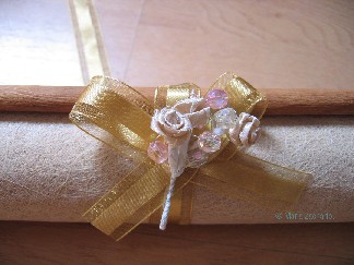
the paper that she used is gorgeous. I will try to post a close up pic, but I want to change the font, and I was thinking of having more written on it, and toning down the bouquet on the tie (fh thinks it's too 'girlie' LOL)

anyway, she is an excellent graphic designer, so anything I tell her to draw she can...I just don't really have any ideas.....a border, trim, monogram....HELP!

uggh....between this and my hair I am ready to elope.
FormerlyKnownAsQ Posted:

Re: need FEEDBACK from you ladies on invite design

Jess I love it!!! I do agree that it does need 'something'. I also think that the flower doesn't go with your whole theme. I think that if you just left the bow it would be perfect.

itslaurie. Posted:

Re: need FEEDBACK from you ladies on invite design

dont get down, this is what trails are for!

I think you do need some more design elements on the invite itself. What sort of feel are you going for again? I can post some ideas for you for inspiration. What colors, style etc. I have seen you post ideas before, but I can't remember. I also agree about the tie, I think you should re-work it.

stephanief Posted:

Re: need FEEDBACK from you ladies on invite design

Those look great !!!!

ChrissynRicky Posted:

Re: need FEEDBACK from you ladies on invite design

I agree with Q - not a fan of the flower.

I also think the font needs to be bigger b/c there's a lot of empty space on the top and the bottom. If you don't want to go with font, then I think a very simple pattern at the top and the bottom going across would suffice.
hmpena Posted:

Re: need FEEDBACK from you ladies on invite design

Jess, they look great! Maybe you could add flourishes or something else decorative to the scrolls. Also, I can't really read what it says but if you have a dramatic font, it will definitely fit yout theme. I agree that just the bow would be beautiful, rather than all of the flowers.

CJStein Posted:

Re: need FEEDBACK from you ladies on invite design

I love the idea of it. Are the handles wooden? I was thinking maybe making them more colorful, like a gold or something. I agree, the flower doesn't really fit, I think a simple ribbon tie would look good.

ChrissynRicky Posted:

Re: need FEEDBACK from you ladies on invite design

OMG! I got it...

at the top - a Shakespearean font type of Monogram....

at the bottom - a bar design going across

in the middle - font increase a tiny bit, adding more information.
cindyandkevin Posted:

Re: need FEEDBACK from you ladies on invite design

Jess, they're great for a 1st time run!! I would def nix the flower, your FH is right!! And I would add your monogram, I think it would be very Shakespearean in a decorative font. You do have a lot of empty space, a border might not hurt. HTH!! GL!!!
JessicaM. Posted:

Re: need FEEDBACK from you ladies on invite design


Posted by CJStein

I love the idea of it. Are the handles wooden? I was thinking maybe making them more colorful, like a gold or something. I agree, the flower doesn't really fit, I think a simple ribbon tie would look good.


thanks ladies. the handles are actually cinnamon sticks (LOVE that! ) the paper is very pourous...she actually layered four sheets of the paper to get it to be printable (my friend is a genius- LOVE her! ). originally I wanted gold font, not black, but she said the paper was absorbing it too much and it wasn't readable.

as for the font, it will be changed and made larger, but I also thought maybe I should add some writing...if I added an excerpt from one of the sonnets, would it go at the bottom or top?

itslaurie. my theme is Shakespearean times, and I am using his sonnets as table numbers and a few other things...my dress is champagne with gold and I am using bright jewel tones in my flowers and colors...
ChrissynRicky Posted:

Re: need FEEDBACK from you ladies on invite design

Jess, since the paper is layered, what about having the Sonnet on the underlying paper in a gold color (that way you can inccorporate the gold and it won't look too dark coming through the top layer)....almost like you flip the page up to see the Sonnet, but you can still see through when looking at the first sheet.

hmpena Posted:

Re: need FEEDBACK from you ladies on invite design

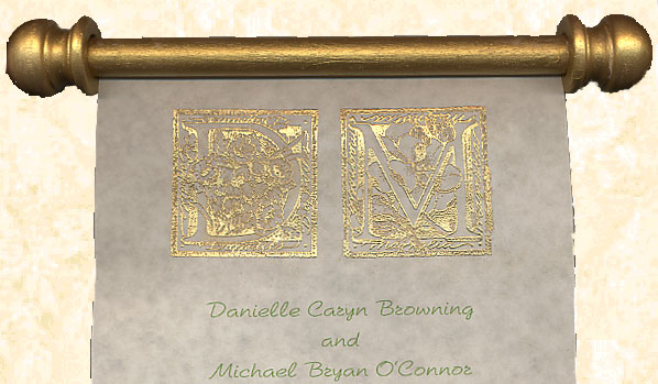
I am still searching... this is what I have found so far.
ChrissynRicky Posted:

Re: need FEEDBACK from you ladies on invite design

Posted by hmpena

I am still searching... this is what I have found so far.


PERFECT!!!!!!!!!!!!!!!!!!!!!!!! Just not as orante.
CJStein Posted:

Re: need FEEDBACK from you ladies on invite design

LOVE the idea of the cinammon sticks. So cool. And your invites will smell pretty...
M&S Sept12006 Posted:

Re: need FEEDBACK from you ladies on invite design

Jess-Instead of the flower, how about using a wax seal? They sell them very inexpensively and I think it would complement your invitation beautifully...Also, with this invitation, I envision the background paper to be a little baroquish...some scrolls or something in the background...

JessicaM. Posted:

Re: need FEEDBACK from you ladies on invite design

thanks ladies...I think I am going to tell her to make me a monogram and all scroll detail to the bottom.

I am also going to add a quote from my beloved Bard....but I am going to spinoff to another thread to so you can vote on that.

please keep ideas and pics coming!
hmpena Posted:

Re: need FEEDBACK from you ladies on invite design

I can't get this post... sorry...

Click on me!!!
hmpena Posted:

Re: need FEEDBACK from you ladies on invite design

I should be working but this is more fun!

Reply to this topic

Log in to reply or quote a post.