Post New Topic

need FEEDBACK from you ladies on invite design

Original post by JessicaM.
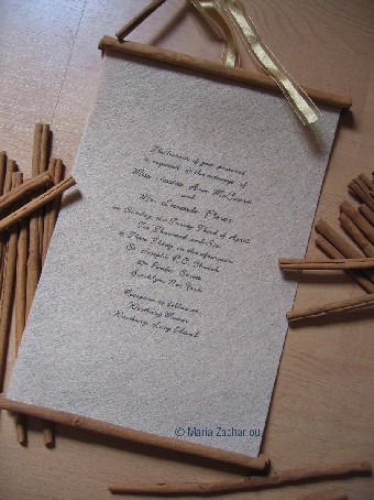
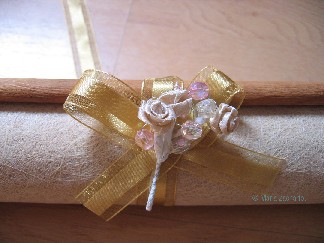
I am really hoping to get feedback of all kinds here. these are the first pics of my invites. the design and pics I gave my friend were followed to a tee, but I feel like they need something more, I just don't know what.

the paper that she used is gorgeous. I will try to post a close up pic, but I want to change the font, and I was thinking of having more written on it, and toning down the bouquet on the tie (fh thinks it's too 'girlie' LOL)

anyway, she is an excellent graphic designer, so anything I tell her to draw she can...I just don't really have any ideas.....a border, trim, monogram....HELP!

uggh....between this and my hair I am ready to elope.
2719321_1.jpg 2719321_2.jpg
itslaurie. Posted:

Re: need FEEDBACK from you ladies on invite design


this is from the Shakespeare linotype font. Your designer probably has free access to these fonts. But here is a link in case you like it: http://www.linotype.com/59127/shakespeare-family.html

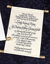
IMO you should put the sonnet quote at the top of the page. I have also seen text and quotes left justified and that looks really nice. A drop case on the quote would give that sort of Shakespearean look as well example:


Incidentally - I love this quote I have seen it on an invite before: Now join your hands, and with your hands your hearts. - William Shakespeare

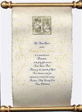
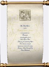
you could also use a design like this:

the image they use on this invite is really nice and simple enough for your designer to re-create easily (if you are on a time constraint).

an image of a featherpen would be nice too.

here are some scroll/vine images:


M&S Sept12006 Posted:

Re: need FEEDBACK from you ladies on invite design
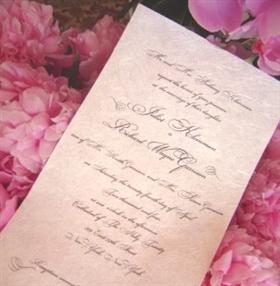

Posted by miss_qiana


Wow...I second this invite...beautiful

Reply to this topic

Log in to reply or quote a post.