
Post New Topic

Need Opinions - Invite Mockup with Pic
Original post by futurestevens

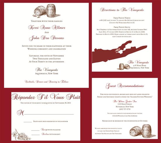
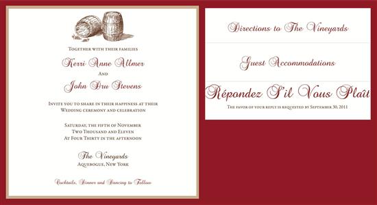
Hey Ladies....I need your honest opinions! I've been working on my invites for awhile and now I need your input. What do you think? Is there anything that needs to be changed/looks weird/makes you want to puke? Please be honest!!


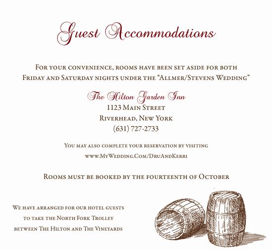
mockup of everything in the pocketfold:
ItalianBella1122 Posted:

Re: Need Opinions - Invite Mockup with Pic

First of all, gorgeous invites!!

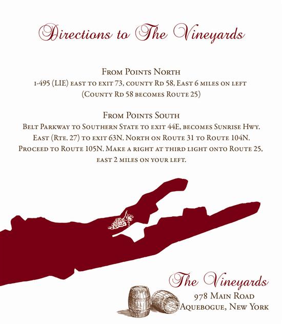
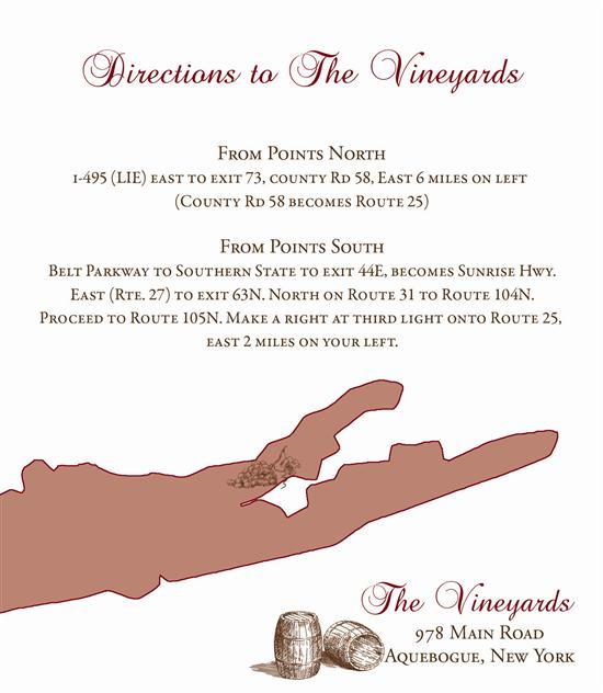
I agree with the image of the island...I don't love it solid but something's off with it outlined....maybe outlined with a faded red filling it?

I think it looks cool filled it...at first it looks like spilled red wine and then it comes to you that its Long Island...which it think is kind of PERFECT considering the theme/venue!

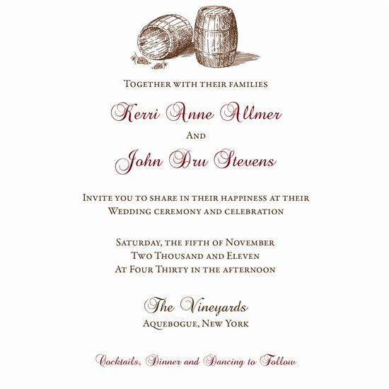
Also, on the invitation card itself, I would try 'cocktails dinner and dancing to follow' in the non-red, non-script font... even if you keep the scripty font, I like the idea that your names are the only red on that card...

But seriously, if you didn't change a thing, it would be perfection!
JandS Posted:

Re: Need Opinions - Invite Mockup with Pic

I really like them! So cute! I agree with the island coloring. Maybe the dark bold burgundy outline with a lighter burgundy for the fill.

NikkiB0401 Posted:

Re: Need Opinions - Invite Mockup with Pic

Did you create these in Photoshop?

futurestevens Posted:

Re: Need Opinions - Invite Mockup with Pic

Ok, here's the direction card with light shading....still not sure what I think about it.


oh, and the sketch of the actual building looked really bad. it was all blurry and looked like poop.
Moonmist09 Posted:

Re: Need Opinions - Invite Mockup with Pic

i agree with the OP, i love everything except the image of Long Island. I didn't catch on to what it was right away and its very in your face at first sight.
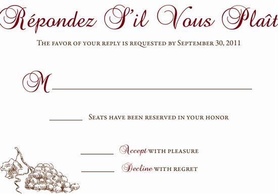
i love the RSVP card spelled out in french
futurestevens Posted:

Re: Need Opinions - Invite Mockup with Pic


Posted by NikkiB0401

Did you create these in Photoshop?


yep
NikkiB0401 Posted:

Re: Need Opinions - Invite Mockup with Pic


Posted by futurestevens

Ok, here's the direction card with light shading....still not sure what I think about it.


oh, and the sketch of the actual building looked really bad. it was all blurry and looked like poop.


What if you made the outline thicker and shaded it in a grayscale instead? I like the solid red tho i think it looks great.
futurestevens Posted:

Re: Need Opinions - Invite Mockup with Pic


Posted by NikkiB0401

What if you made the outline thicker and shaded it in a grayscale instead? I like the solid red tho i think it looks great.


shading in grey scale looked kind of strange since everything on the invites is in the brown family
adelz Posted:

Re: Need Opinions - Invite Mockup with Pic

BEAUUUUUUUUUTIFUL!!!!!!

futurestevens Posted:

Re: Need Opinions - Invite Mockup with Pic


Posted by adelz

BEAUUUUUUUUUTIFUL!!!!!!


adelina, you have an eye for this sort of stuff- which direction card looks best to you (if any)?
NikkiB0401 Posted:

Re: Need Opinions - Invite Mockup with Pic


Posted by futurestevens


Posted by NikkiB0401

What if you made the outline thicker and shaded it in a grayscale instead? I like the solid red tho i think it looks great.


shading in grey scale looked kind of strange since everything on the invites is in the brown family


I meant use the grey scale effect but with the brown. Or what if you made the island smaller still using the solid red? Maybe it wont look so bold if you decrease it.
HSsweethearts Posted:

Re: Need Opinions - Invite Mockup with Pic

I think the lighter red tone looks better, but you lose the grape symbol a little bit.

I think out of the 3 I personally like the outline the best
futurestevens Posted:

Re: Need Opinions - Invite Mockup with Pic


Posted by NikkiB0401


Posted by futurestevens


Posted by NikkiB0401

What if you made the outline thicker and shaded it in a grayscale instead? I like the solid red tho i think it looks great.


shading in grey scale looked kind of strange since everything on the invites is in the brown family


I meant use the grey scale effect but with the brown. Or what if you made the island smaller still using the solid red? Maybe it wont look so bold if you decrease it.


gotcha! ok, so i did that with the brown and it looked ok...although i think the lighter red looked better. i'm playing around with other ideas now (not using the LI outline) to see what I can come up with

thanks!!

Reply to this topic

Log in to reply or quote a post.