Post New Topic

Opinions on Invite

cherish83 Posted:

Opinions on Invite

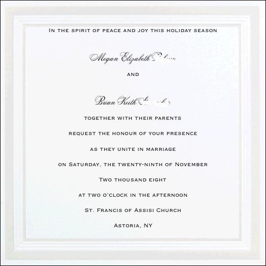
I am FINALLY ordering my invitations. I am DIYing the invites, however to save me some stress I've decided to cheat a bit

I ordered a sample of this invite and it fits with the pocketfold i am ordering from cardsandpockets.com.

Can you give me your opinions and proofread? THANKS!

Do you think I should take out, 'In the spirit of peace and joy this holiday season'?
Maria31 Posted:

Re: Opinions on Invite

I really like it!!! My only recommendation is to maybe condence the copy so it isn't so close to the top/bottom borders. Other than that... Beautiful!

Mici n KC Posted:

Re: Opinions on Invite

I like them!

shopaholic07 Posted:

Re: Opinions on Invite

Very pretty!!! I like them!!!!!!!
cherish83 Posted:

Re: Opinions on Invite


Posted by Maria31

I really like it!!! My only recommendation is to maybe condence the copy so it isn't so close to the top/bottom borders. Other than that... Beautiful!


I thought about that. I had put a space between the first line and my name and FH's name and the next line, maybe i'll take that out and move the first line down and other lines up

THANKS!
missliss Posted:

Re: Opinions on Invite


Posted by cherish83


Posted by Maria31

I really like it!!! My only recommendation is to maybe condence the copy so it isn't so close to the top/bottom borders. Other than that... Beautiful!


I thought about that. I had put a space between the first line and my name and FH's name and the next line, maybe i'll take that out and move the first line down and other lines up

THANKS!


Or maybe eliminate the space between the church name and Astoria. And maybe also between the date, year and time. So they're like each their own paragraph.

Otherwise they're great. Very pretty.
cherish83 Posted:

Re: Opinions on Invite


Posted by missliss


Posted by cherish83


Posted by Maria31

I really like it!!! My only recommendation is to maybe condence the copy so it isn't so close to the top/bottom borders. Other than that... Beautiful!


I thought about that. I had put a space between the first line and my name and FH's name and the next line, maybe i'll take that out and move the first line down and other lines up

THANKS!


Or maybe eliminate the space between the church name and Astoria. And maybe also between the date, year and time. So they're like each their own paragraph.


Otherwise they're great. Very pretty.


There is actually no lines in between those. Its just the lines are spaced
GinaZ Posted:

Re: Opinions on Invite

I learned something today. If you use the british spelling of Honour (vs. honor) then you should do the british way of writing out the year by saying two thousand AND eight as opposed to not using the 'and.' snowcutie82 found that out somwhere and told me about it.

cherish83 Posted:

Re: Opinions on Invite


Posted by GinaZ

I learned something today. If you use the british spelling of Honour (vs. honor) then you should do the british way of writing out the year by saying two thousand AND eight as opposed to not using the 'and.' snowcutie82 found that out somwhere and told me about it.


Good to know! Thanks! I'm going to change the spelling
SoonToBeMrsScott Posted:

Re: Opinions on Invite

looks good

GinaZ Posted:

Re: Opinions on Invite


Posted by cherish83


Posted by GinaZ

I learned something today. If you use the british spelling of Honour (vs. honor) then you should do the british way of writing out the year by saying two thousand AND eight as opposed to not using the 'and.' snowcutie82 found that out somwhere and told me about it.


Good to know! Thanks! I'm going to change the spelling


LOL I never ever would have thought of that otherwise!!!

The invite looks great btw!!
Princess Cut Bride Posted:

Re: Opinions on Invite

Hey Megan...I think they look great!

I'm not too crazy about that top line...jmo...please don't get offended!
cherish83 Posted:

Re: Opinions on Invite


Posted by Princess Cut Bride

Hey Megan...I think they look great!

I'm not too crazy about that top line...jmo...please don't get offended!


I'm not offended. I want honest opinions. Thank you
Princess Cut Bride Posted:

Re: Opinions on Invite


Posted by cherish83


Posted by Princess Cut Bride

Hey Megan...I think they look great!

I'm not too crazy about that top line...jmo...please don't get offended!


I'm not offended. I want honest opinions. Thank you


You're welcome!
cherish83 Posted:

Re: Opinions on Invite


Posted by Princess Cut Bride


Posted by cherish83


Posted by Princess Cut Bride

Hey Megan...I think they look great!

I'm not too crazy about that top line...jmo...please don't get offended!


I'm not offended. I want honest opinions. Thank you


You're welcome!


Bump
CD516 Posted:

Re: Opinions on Invite

I think they are really pretty and elegant!!!

TrueLoveIn2008 Posted:

Re: Opinions on Invite

I would remove the extra space after 'AND' - before Brian's name. I feel the AND should be evenly spaced between your name and his.

I prefer 'two thousand eight' so I would make honour 'honor.' JMO.

But I love the invites! Classy and elegant.
Cutechef729 Posted:

Re: Opinions on Invite

I think they look great! I do like the top line-it's different.

cherish83 Posted:

Re: Opinions on Invite


Posted by JBoothIn2008

I would remove the extra space after 'AND' - before Brian's name. I feel the AND should be evenly spaced between your name and his.

I prefer 'two thousand eight' so I would make honour 'honor.' JMO.

But I love the invites! Classy and elegant.


I noticed the 'and' wasnt evenly placed too. On the generic sample I got in the mail it is evenly placed. So i'm hoping thats its just what the computer can do since its quickly computer generated, ya know. I definitely want it without the and after thousand, so I will be spelling honor the american way

Thanks for all the input!
megzzie Posted:

Re: Opinions on Invite

I really like them!

Reply to this topic

Log in to reply or quote a post.