Post New Topic

opinions please!!!

jwleewedding Posted:

opinions please!!!

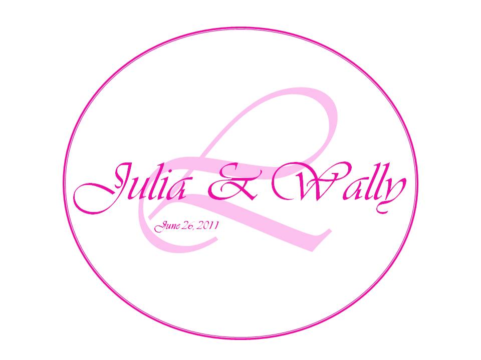
so i've been trying to create my own monogram...and this is what i've come up with so far....

can anyone suggest ideas/opinions as to what i can do to make it look better or what i should change?

TIA!
MrsVtoBe Posted:

Re: opinions please!!!

Great job. IMO, one thing I would change is the font of the intial, it's kind of hard to read what letter it is.

VCanizalez Posted:

Re: opinions please!!!

I actually Love it!!!!!!!!

Hmmm... Ur date... Just to b fancier... Maybe u could do the Date in the little CURVE...

=)


{{HOW did you did this??????!!!!!! I want to Do mine!!!}}}}
allornil Posted:

Re: opinions please!!!


Posted by MrsVtoBe

Great job. IMO, one thing I would change is the font of the intial, it's kind of hard to read what letter it is.


I agree but otherwise its fab!
jwleewedding Posted:

Re: opinions please!!!


Posted by VCanizalez

I actually Love it!!!!!!!!

Hmmm... Ur date... Just to b fancier... Maybe u could do the Date in the little CURVE...

=)


{{HOW did you did this??????!!!!!! I want to Do mine!!!}}}}


yea...the date is bothering me a little...but i dont know where else to put it...at first i was thinking of putting it at the bottom of the 'L'...but then the date will be slanted which looks weird....

i used microsoft word to make it!
jwleewedding Posted:

Re: opinions please!!!


Posted by MrsVtoBe

Great job. IMO, one thing I would change is the font of the intial, it's kind of hard to read what letter it is.


Yea.. i was thinking that too...but 'L' is such a hard letter to work with... really hard to make it look fancy..lol

i can't find a better font...suggestions?
MrsVtoBe Posted:

Re: opinions please!!!


Posted by jwleewedding


Posted by MrsVtoBe

Great job. IMO, one thing I would change is the font of the intial, it's kind of hard to read what letter it is.


Yea.. i was thinking that too...but 'L' is such a hard letter to work with... really hard to make it look fancy..lol

i can't find a better font...suggestions?


go to dafont.com you can dowload a ton of new fonts to your computer!
wedding_girl Posted:

Re: opinions please!!!

I love it!! it looks awesome
jwleewedding Posted:

Re: opinions please!!!


Posted by MrsVtoBe


Posted by jwleewedding


Posted by MrsVtoBe

Great job. IMO, one thing I would change is the font of the intial, it's kind of hard to read what letter it is.


Yea.. i was thinking that too...but 'L' is such a hard letter to work with... really hard to make it look fancy..lol

i can't find a better font...suggestions?


go to dafont.com you can dowload a ton of new fonts to your computer!


haha, thanks! i've been there...soooo many to choose from! i was going blind.

I'll check it out again, thanks!
rendel Posted:

Re: opinions please!!!

So talented!!!!!

Dc1204 Posted:

Re: opinions please!!!


Posted by allornil


Posted by MrsVtoBe

Great job. IMO, one thing I would change is the font of the intial, it's kind of hard to read what letter it is.


I agree but otherwise its fab!


I agree but I LOVE IT
futurestevens Posted:

Re: opinions please!!!

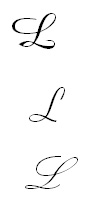
what about any of these 'L's? they're a little bit easier to read I think.
futurestevens Posted:

Re: opinions please!!!


Posted by jwleewedding


Posted by VCanizalez

I actually Love it!!!!!!!!

Hmmm... Ur date... Just to b fancier... Maybe u could do the Date in the little CURVE...

=)


{{HOW did you did this??????!!!!!! I want to Do mine!!!}}}}


yea...the date is bothering me a little...but i dont know where else to put it...at first i was thinking of putting it at the bottom of the 'L'...but then the date will be slanted which looks weird....

i used microsoft word to make it!


what if you made the date curve along the bottom of the circle, inside of it. kind of like in a 'U' shape?
jwleewedding Posted:

Re: opinions please!!!


Posted by futurestevens

what about any of these 'L's? they're a little bit easier to read I think.


i like the last one..which font is that?
futurestevens Posted:

Re: opinions please!!!


Posted by jwleewedding


Posted by futurestevens

what about any of these 'L's? they're a little bit easier to read I think.


i like the last one..which font is that?


it's called 'Kunstler Script'
i think this one was preloaded in the newest version of Microsoft Word. not sure anymore though because i download a lot of fonts lol
FutureMrsPanuch Posted:

Re: opinions please!!!


Posted by MrsVtoBe

Great job. IMO, one thing I would change is the font of the intial, it's kind of hard to read what letter it is.


ITA... love it!!!!
jwleewedding Posted:

Re: opinions please!!!


Posted by futurestevens


Posted by jwleewedding


Posted by futurestevens

what about any of these 'L's? they're a little bit easier to read I think.


i like the last one..which font is that?


it's called 'Kunstler Script'
i think this one was preloaded in the newest version of Microsoft Word. not sure anymore though because i download a lot of fonts lol


haha, ok thanks! i'll look for it!
VCanizalez Posted:

Re: opinions please!!!

I think if you could 'Curve' the date.... Would be even Better...!!!!

jwleewedding Posted:

Re: opinions please!!!


Posted by VCanizalez

I think if you could 'Curve' the date.... Would be even Better...!!!!


ok, i'm going to try all these suggestions. looking for better fonts now!

thanks girls!!! this is why i love LIW!
BellaFiore Posted:

Re: opinions please!!!

Wow, you have skills! I love it, I didn't even think the date was that noticeable.

Reply to this topic

Log in to reply or quote a post.