
Member since
Please vote on these invites ...
Member since
Re: Please vote on these invites ...
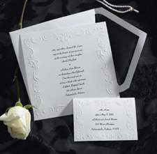
#2
Member since
Re: Please vote on these invites ...
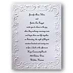
Really like #2
Member since
Re: Please vote on these invites ...
Member since
Re: Please vote on these invites ...
Member since
Re: Please vote on these invites ...
Member since
Re: Please vote on these invites ...
I like #2 and would probably stick with the black ink. I would have to see red and black side by side to be sure though.
Member since
Re: Please vote on these invites ...
I like #2 with black ink. It's classic. I've found that I'm a traditionalist when it comes to invitations. It's also easier to read.
Member since
Re: Please vote on these invites ...
I like # 2
Member since
Re: Please vote on these invites ...
Member since
Re: Please vote on these invites ...
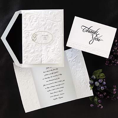
#3
Member since
Re: Please vote on these invites ...
#2 - and stick with black ink!
Member since
Re: Please vote on these invites ...
I like #2 and I think the Red would look pretty!
Member since
Re: Please vote on these invites ...
#2
Member since
Re: Please vote on these invites ...
if you do a red ink, it would have to be a vey deep red, like a burgundy, or it will be hard to read against white. (Red is the hardest color to read.....)
Member since
Re: Please vote on these invites ...
Member since
Re: Please vote on these invites ...
# 2...and if your wedding is 'red' i would def go with it!
Member since
Re: Please vote on these invites ...
Member since
Re: Please vote on these invites ...
I say #2 with black ink. Red may end up being difficult on the eyes (too harsh to focus on the words). Maybe see if they have a sample to show you first
Member since
Re: Please vote on these invites ...
if you like the red ink then i think you should do it. i wanted silver to match my theme and everyone said you couldnt read it but i did it anyway and not only could you read it people actually commented on how lovely it looked. i agree with the deeper red though just to make sure it will show. i love 2

