
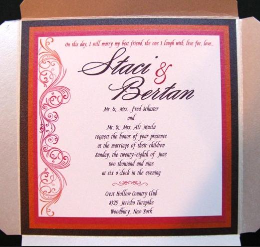
As before I told everyone that I love my invte but the font is small. She sent me this please tell me what you think.
the original is in my album cant get it to post
Watever143
Posted:
Member since
Re: Tessa Invite
the big difference is that our parents names are on the same line does that look stupid???//
twoifbysea
Posted:
Member since
Re: Tessa Invite
I feel like your name and your FH's name are REALLY big -- maybe she can make those smaller so the rest of the text isn't as cramped? It's really pretty though!!
Watever143
Posted:
Member since
Re: Tessa Invite
What if I remove the address of crest hollow????
dedecakes
Posted:
Member since
Re: Tessa Invite
I don't have the address on the invite she made for me. I think that's fine without it. You have a direction card, so it's not necessary to have the full address on the invite, too.
I'm a little confused with the dotted-line. I like it better w/o it. It doesnt look as formal with it.
Watever143
Posted:
Member since
Re: Tessa Invite
the line are nuttin thats where she has to cut they wouldnt be on the invite.
What does everypone think about both parents name on the same line
lauraandrob2009
Posted:
Member since
Re: Tessa Invite
First off - very pretty - love the graphic - definitely feel it is too packed. I would remove the address of Crest Hollow to make some room (I assume you have a direction card included that would give you that?) and I think both parents names on same line looks fine. That should open it up a little.
dedecakes
Posted:
Member since
Re: Tessa Invite
I think it would look better with the parents names on separate lines, but I dont know if you'll be able to fit everything in then. You might have to sacrifice the size of the font. I think a smaller font would be fine, though. The one in your album looks fine.
twoifbysea
Posted:
Member since
Re: Tessa Invite
If you are including a directions card, I would definitely omit the address on the invite itself.
dedecakes
Posted:
Member since
Re: Tessa Invite
So, this is your original? If so, what about changing the style of font?
or what about breaking it up a bit by putting the parents names at the top? I know that is traditional and it seems like you want something that is not so traditional.
JenBill61210
Posted:
Member since
Re: Tessa Invite
i agree, maybe you can put your parents name on the top line, then your names (with the font a bit smaller)
ckleinismine
Posted:
Member since
Re: Tessa Invite
Its nice but I feel like its too busy and hard to read
mlcvln129
Posted:
Member since
Re: Tessa Invite
I DEFINITELY think that both sets of parents could be on the same line. Then, you can increase the size of the font underneath your names.
Also, ditto to removing the Jericho Turnpike info on the invite. . .no need for it if they're going to have a direction card in their envelope.
Maybe you should decrease the size of your names. . .they don't need to be nearly so overwhelmingly big, IMO.
FuTuRe MrS MaZz
Posted:
Member since
Re: Tessa Invite
theres a huge diff bewteen size of font of your names and the rest of the invite... i would make your names smaller... also it looks strange to me at least bc it starts out with your names ... i would move them to the middle more and put text before and after it... thats what i did... you can check out mine in my album
ETA: i dont like the parents names all on 1 line
KerriJohnS
Posted:
Member since
Re: Tessa Invite
I love love love the side. How the colors change into one another.
it's gorgeous! Love it!
Im a Pepper
Posted:
Member since
Re: Tessa Invite
It's beautiful! But the text feels cramped. I agree that maybe if the names were smaller it might fit better.
Watever143
Posted:
Member since
Re: Tessa Invite update new pic
Took people Idea and this is what tessa came up with what do youthink
Watever143
Posted:
Member since
Re: Tessa Invite
Also which sounds better
Reception to immediately follow or Reception immediately following