Post New Topic

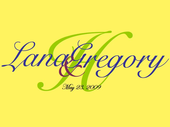
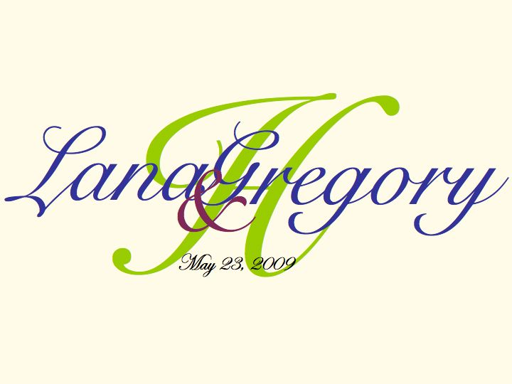
Which Monogram Do You Like Better -- NEW CHOICE

Original post by lanamanitta
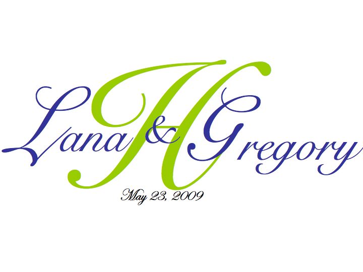
We've narrowed it down over on the '09 board, so I'm opening it up to a broader vote. I'm going to have whatever is chosen on my invite seals, favor tags, perhaps placecards and table numbers, so it's important! Thanks!

I might fudge with the colors a bit, but I've decided on yellow, purple and green for flowers, etc. (just not girls' dresses). Let me know if the color combo works too . . .

Thank you!

OK LADIES . . . . THIS IS REALLY HELPFUL!!! NOW I'VE ADDED THE CREAM BACKGROUND . . . DOES THAT CHANGE OPINION?
6516824_1.jpg 6516824_2.jpg 6516824_3.jpg
JodyLC Posted:

Re: Which Monogram Do You Like Better -- NEW CHOICE

Posted by lanamanitta


Posted by JodyLC

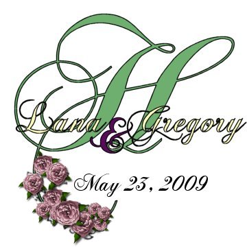
What about something like this? I know it is not in Edwardian Script but I just did it REAL quick to show the black outline. I thought it made it POP. Was easier to show you then to describe it.


Wow you're good!!!


It is 'hidden talent' you should see some of the graphics I do for friends websites... my hobby.. if you like that or the font or want it changed I can zip one up for you even match your colors better and e-mail it to you.

The font is Chopin Script
lanamanitta Posted:

Re: Which Monogram Do You Like Better -- NEW CHOICE


Posted by JodyLC


Posted by lanamanitta


Posted by JodyLC

What about something like this? I know it is not in Edwardian Script but I just did it REAL quick to show the black outline. I thought it made it POP. Was easier to show you then to describe it.


Wow you're good!!!


It is 'hidden talent' you should see some of the graphics I do for friends websites... my hobby.. if you like that or the font or want it changed I can zip one up for you even match your colors better and e-mail it to you.

The font is Chopin Script


Oh my gosh! Create away!! Thank you! That font is great, and the H should really be the biggest part . . . . I'm going to do purple green and yellow flowers, but the monogram doesn't have to have all of that (though invites, for which this will be the seal) will incorporate definitely purple and green, and I went with cream because it's a HINT of yellow . . ..


MyLobster Posted:

Re: Which Monogram Do You Like Better -- NEW CHOICE


Posted by JodyLC

LOL it wasn't her.. was just showing her with an outline... but THANKS!!!


I guess I should've read it first!
melcc83 Posted:

Re: Which Monogram Do You Like Better -- NEW CHOICE

i LIKE THEM BOTH BUT i LIKE THE WHITE BETTER

tstaa1vw Posted:

Re: Which Monogram Do You Like Better -- NEW CHOICE

I think the yellow takes away from the monogram...I like the white one without the purple &

Great job!
stinenandy2010 Posted:

Re: Which Monogram Do You Like Better -- NEW CHOICE

White one
pa56 Posted:

Re: Which Monogram Do You Like Better -- NEW CHOICE

white

Wifeynella Posted:

Re: Which Monogram Do You Like Better -- NEW CHOICE


Posted by lanamanitta

We've narrowed it down over on the '09 board, so I'm opening it up to a broader vote. I'm going to have whatever is chosen on my invite seals, favor tags, perhaps placecards and table numbers, so it's important! Thanks!

I might fudge with the colors a bit, but I've decided on yellow, purple and green for flowers, etc. (just not girls' dresses). Let me know if the color combo works too . . .

Thank you!

OK LADIES . . . . THIS IS REALLY HELPFUL!!! NOW I'VE ADDED THE CREAM BACKGROUND . . . DOES THAT CHANGE OPINION?


I like the 3rd one, if you move the date to the right so its more readable
CMBove Posted:

Re: Which Monogram Do You Like Better -- NEW CHOICE

I love the 3rd option

fiore76 Posted:

Re: Which Monogram Do You Like Better -- NEW CHOICE

the third one.
Itsfinallymyturn Posted:

Re: Which Monogram Do You Like Better -- NEW CHOICE

Love the monogram, but agree it gets lost on the yellow background. Go white!

mls282 Posted:

Re: Which Monogram Do You Like Better -- NEW CHOICE

3rd one... cream one
CloudNine Posted:

Re: Which Monogram Do You Like Better -- NEW CHOICE

i lik ethe 3rd one best

MrsInglima Posted:

Re: Which Monogram Do You Like Better -- NEW CHOICE

The yellow one is definitely too much. The white is a lot more elegant.

karabara Posted:

Re: Which Monogram Do You Like Better -- NEW CHOICE


Posted by lanamanitta


Posted by JodyLC


Posted by lanamanitta


Posted by JodyLC

What about something like this? I know it is not in Edwardian Script but I just did it REAL quick to show the black outline. I thought it made it POP. Was easier to show you then to describe it.


Wow you're good!!!


It is 'hidden talent' you should see some of the graphics I do for friends websites... my hobby.. if you like that or the font or want it changed I can zip one up for you even match your colors better and e-mail it to you.

The font is Chopin Script


Oh my gosh! Create away!! Thank you! That font is great, and the H should really be the biggest part . . . . I'm going to do purple green and yellow flowers, but the monogram doesn't have to have all of that (though invites, for which this will be the seal) will incorporate definitely purple and green, and I went with cream because it's a HINT of yellow . . ..


How are you girls makign these? do you have a special program? i'm so jealous of your talent!
lilpiggy742 Posted:

Re: Which Monogram Do You Like Better -- NEW CHOICE

2 things....

1. I like the cream background, its not as harsh as the white and you can read the monogram great

2. What are the monograms used for and how the he l l do i make one!
Lissy3077 Posted:

Re: Which Monogram Do You Like Better -- NEW CHOICE

i voted for the white one!!!

Celeste617 Posted:

Re: Which Monogram Do You Like Better -- NEW CHOICE

I like the white one
JodyLC Posted:

Re: Which Monogram Do You Like Better -- NEW CHOICE


Posted by karabara


Posted by lanamanitta


Posted by JodyLC


Posted by lanamanitta


Posted by JodyLC

What about something like this? I know it is not in Edwardian Script but I just did it REAL quick to show the black outline. I thought it made it POP. Was easier to show you then to describe it.


Wow you're good!!!


It is 'hidden talent' you should see some of the graphics I do for friends websites... my hobby.. if you like that or the font or want it changed I can zip one up for you even match your colors better and e-mail it to you.

The font is Chopin Script


Oh my gosh! Create away!! Thank you! That font is great, and the H should really be the biggest part . . . . I'm going to do purple green and yellow flowers, but the monogram doesn't have to have all of that (though invites, for which this will be the seal) will incorporate definitely purple and green, and I went with cream because it's a HINT of yellow . . ..


How are you girls makign these? do you have a special program? i'm so jealous of your talent!


I do mine in Paint Shop pro here is one I was just playing with.
MelissaH43 Posted:

Re: Which Monogram Do You Like Better -- NEW CHOICE

I like three the BEST! The Ivory is not bland like white would be, but not busy like yellow.

:0)

Reply to this topic

Log in to reply or quote a post.