
Member since
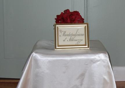
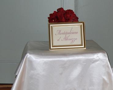
Which one do you like better?
Member since
Re: Which one do you like better?
I like them both but I really like the sugarplum...i don't think its hard to see.. is there a way you can use black lettering with the sugarplum on top of it... so you have both and then it is really bold
Member since
Re: Which one do you like better?
I like the sugarplum one. I don't think its hard to see at all and I think the font size is perfect on the sugarplum frame.
Member since
Re: Which one do you like better?
I would go with the sugarplum
Member since
Re: Which one do you like better?
i like the sugarplum!!
Member since
Re: Which one do you like better?
i like the sugarplum
Member since
Re: Which one do you like better?
I like the sugarplum better too.
Member since
Re: Which one do you like better?
Member since
Re: Which one do you like better?
sugarplum
Member since
Re: Which one do you like better?
the colored one
Member since
Re: Which one do you like better?
Anyone else? Does anyone like the black lettering? Black is more formal. I just don't want the plum to make it look like a birthday party, lol.
Member since
Re: Which one do you like better?
I actually like the black lettering a little bit better. It is easier to see and is more formal. I like the sugarplum too, but if it were me, I'd use the black.
Member since
Re: Which one do you like better?
black is more formal, and looks nice with the gold of the frame...besides I hate when everything is 'matchy-matchy' (as my mom would say)
Member since
Re: Which one do you like better?
I think you can go either way
Member since
Re: Which one do you like better?
I like the sugarplum because it would match with the rest of your table numbers and you can definitely see it from afar.
Member since
Re: Which one do you like better?
the first picture
Member since
Re: Which one do you like better?
I like the 1st one
Member since
Re: Which one do you like better?
I like the black one better, the sugar plum is nice I just think the black one is a little more formal jmo

