
Member since
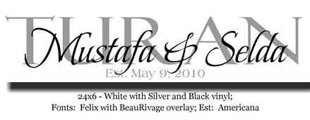
girls please help me decide which one

Member since
Re: girls please help me decide which one
i love the 1st one
Member since
Re: girls please help me decide which one
Personally, I think the second one is easier to read. But ask her to make a third, with the black and red like you asked. She'll definitely do it; she made me a ton of proofs before I decided.
Member since
Re: girls please help me decide which one
Member since
Re: girls please help me decide which one
they are both pretty... but I agree the 2nd one is easier to read
Member since
Re: girls please help me decide which one
I really like the second one-it's easy to read and I think it looks very classic. But if it's not what you want ask for another proof. Do you have any ideas about colors of your new place?
Member since
Re: girls please help me decide which one
I agree with the other girls that the 2nd one is easier to read
Member since
Re: girls please help me decide which one
#2
Member since
Re: girls please help me decide which one
I agree with the rest that the 2nd one is mich easier to read... see if she could modify the 1st one to make it more legible.
Member since
Re: girls please help me decide which one
i like the 1st one better... but the 2nd one is easier to read
Member since
Re: girls please help me decide which one
Member since
Re: girls please help me decide which one
I really like #2! It's a lot easier to read and I like the colors. I'd like to see the 3rd sample when she makes though!
Member since
Re: girls please help me decide which one
#2
Member since
Re: girls please help me decide which one
1st one!
Member since
Re: girls please help me decide which one
The first one definitely!
Member since
Re: girls please help me decide which one
i really like the first one better... but it may be easier to read if you had her reverse the light and dark brown font colors?!
Member since


