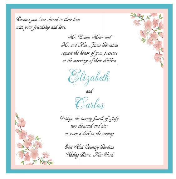
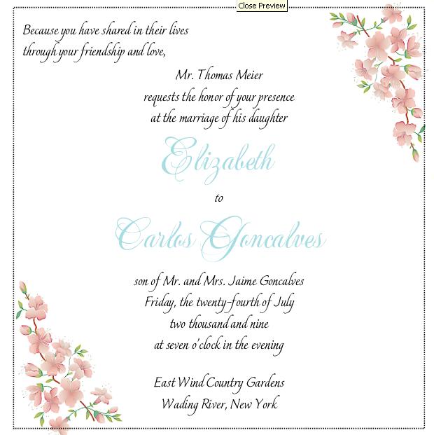
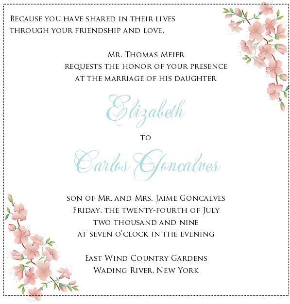
I think I like the second one better, that block text seems to go nicer with the flowers.
ETA: I meant third one, I didn't realize the first two were slightly different fonts, I thought just a close up of the same oops.
MikesBride2B
Posted:
Member since
Re: Help with Final Edit
I love the 3rd one!
springsandra
Posted:
Member since
Re: Help with Final Edit
I like the fonts on the third one, but I like the wording of the first one best.
I believe I read many places that you are only supposed to write 'the honor of your presence' when you are inviting people to a house of worship. I was told by the etiquette police I couldn't use that phrase because we are getting married at the RH.
I love it when the invites are really legible, though, so you may not like my advice about it.
Your colors are just gorgeous though!
lanamanitta
Posted:
Member since
Re: Help with Final Edit
I like the second font, but the first wording.
FutureMrsG
Posted:
Member since
Re: Help with Final Edit
I like the third one the best.
dedecakes
Posted:
Member since
Re: Help with Final Edit
I like the second font the best. FH is a programmer/graphics/web designer. He said that you never use all capital letters because A- It looks like you are shouting to the reader and B- It is not natural text. We naturally read in lower caps...so all caps is harder for someone to read. But that's just his opinion...what does he know! ;P
chicky724
Posted:
Member since
Re: Help with Final Edit
I like either of the first two!
bride2binli
Posted:
Member since
Re: Help with Final Edit
i like the first, I am having trouble reading the font in the others and the color is more vibrant, honestly they are all nice and you have to be the one to love it!
xosweetiexo
Posted:
Member since
Re: Help with Final Edit
I like number 3 , but I like the wording of the parents from number 1
20mrsc10
Posted:
Member since
Re: Help with Final Edit
i like number 3 the best..i think it's a nice contrast
PROBM
Posted:
Member since
Re: Help with Final Edit
i like the second one he best, i would like to see the top wording centered
MrsJuneB2B
Posted:
Member since
Re: Help with Final Edit
i love the third one!!
mokie74m
Posted:
Member since
Re: Help with Final Edit
I think the 3rd one goes best with the rest of the invite. By the way, very nice invitation.
KellymKuehn
Posted:
Member since
Re: Help with Final Edit
I like them all- I think they are beautiful but the Second one is the best.
One Thing- I am also getting married at EW (12 days before you) and I think you are supposed to say
The Country Gardens at East Wind
On the papers they gave me when we booked it says to write it like that on your invites
I don't know if it makes a difference?
Utopia923
Posted:
Member since
Re: Help with Final Edit
Date Twin and Tessa twin!!!
I like the second one the best!
I am actually just going to post a new topic about how I'm concerned that my invites aren't going to get done in time! My time frame for completion is May 10-20 and I'm at #13 in the production list. They're already scheduled to get done later than I'd hoped...
But I love your invite!! Very pretty!!
stargazerlily
Posted:
Member since
Re: Help with Final Edit
I like the first one the best!
littlepixie12
Posted:
Member since
Re: Help with Final Edit
I like the second and third ones best... I did something similar to the third one for my invites.
HTH!
tgrlily339
Posted:
Member since
Re: Help with Final Edit
3rd all the way... Its is a nice contrasts between the fonts. I am not a huge fan of scripty fonts with scripty fonts. I think the third is classic and elegant and has good legibility! (but ALL are beautiful!)